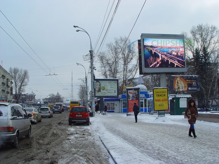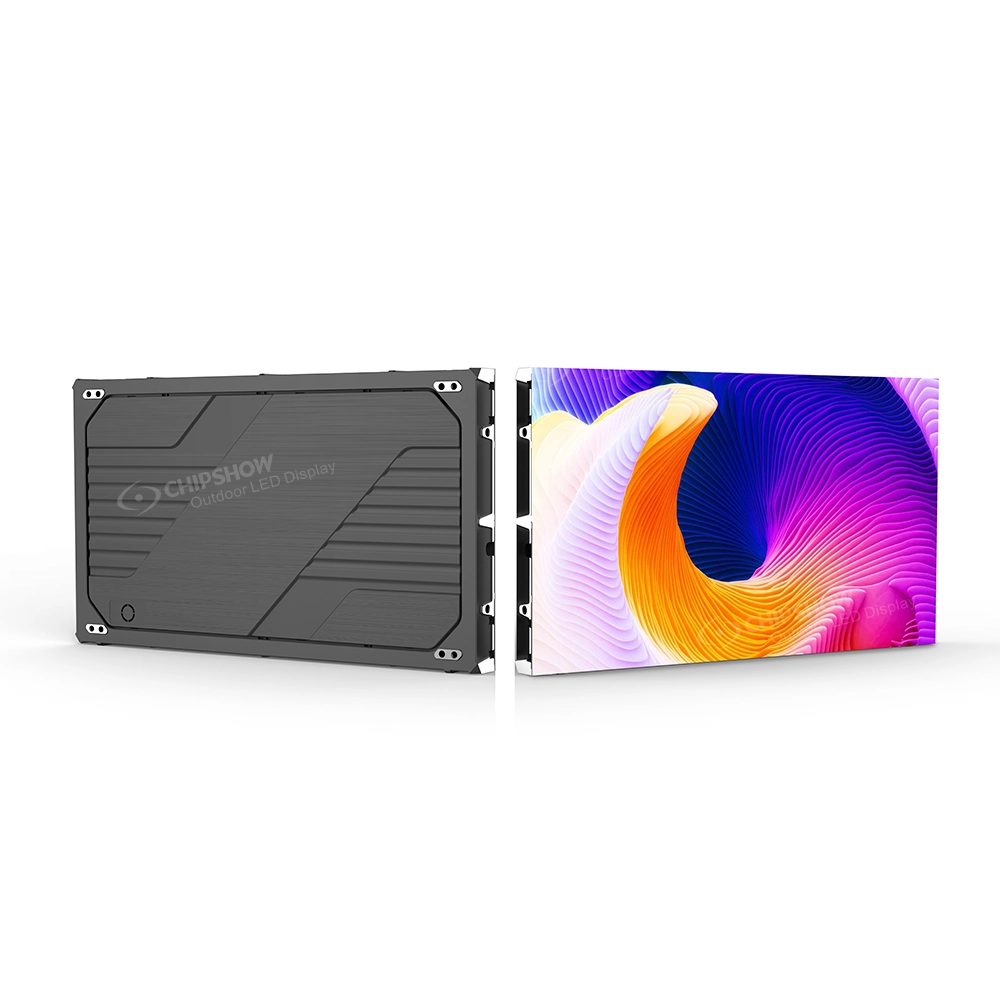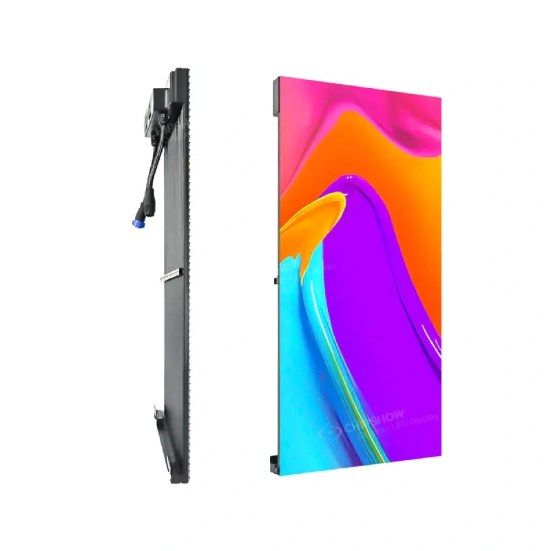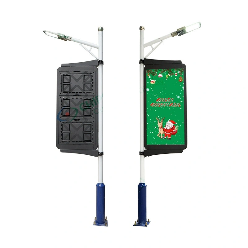
Long-distance LED signage is defined by viewing conditions rather than one audience type or fixed viewing distance. Start with how far away the text or logo must work, how the viewer approaches the sign, the available viewing time, and the required character size. Then compare how many pixels P6.67, P10, and P16 provide within the same physical content area. A finer pitch adds pixel density for smaller text, detailed logos, or higher information density, but it does not automatically extend viewing distance. Define the viewing conditions first. Choose pixel pitch second.
Not sure which pitch or cabinet format fits your build? Run the requirements through the Chipshow USA LED sign selector to shortlist signs by nearest viewer and sign opening before requesting a quote.
Los carteles LED de larga distancia aparecen en muchos proyectos de señalización norteamericana.
Un conductor puede necesitar reconocer un negocio en la carretera antes de llegar a una entrada. Un peatón puede identificar un nombre universitario desde el otro lado de una zona de aparcamiento. Los visitantes que se acerquen a un campus médico pueden necesitar reconocer un logotipo y un cartel de entrada desde la distancia. Un cartel de centro comercial puede servir tanto al tráfico en movimiento como a las personas que se acercan a través de una gran propiedad.
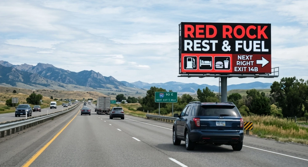
Estas situaciones comparten un requisito básico:
El texto o logotipo debe seguir siendo útil antes de que el espectador llegue al cartel.
Eso no significa que todas las pantallas de larga distancia necesiten la misma altura de caracteres, disposición de contenido o tono de píxeles.
Un espectador que pase junto a un cartel de carretera puede tener solo unos segundos para reconocer un mensaje corto. Alguien que camine hacia una entrada del campus puede tener mucho más tiempo para estudiar la misma exhibición física. Un espectador fijo puede tener tiempo para leer información secundaria que sería poco práctica para tráfico rápido.
Para un diseñador de señales o estimador, esto cambia el punto de partida.
La primera pregunta no debería ser:
¿Debería este proyecto usar P6.67, P10 o P16?
Debería ser:
¿Qué necesita reconocer o leer el espectador, desde qué distancia y bajo qué condiciones de visionado?
A partir de ahí, se pueden evaluar en secuencia la altura de los caracteres, la complejidad del contenido, la matriz de píxeles y el tono de píxeles.
1. ¿Qué hace que un cartel LED sea de larga distancia?
No existe una distancia universal a la que un cartel LED se convierta en una pantalla de "larga distancia".
La relación a distancia se entiende mejor como una Condición de visión basada en la distancia.
Un cartel se convierte en un proyecto de larga distancia cuando un texto importante, un logotipo, el nombre de una propiedad u otra información visual debe permanecer reconocible u legible antes de que el espectador llegue al área inmediata del cartel.
Cuatro variables ayudan a definir esa condición.
Distancia de visualización
Empieza por la distancia a la que el contenido debe empezar a funcionar.
Esto puede ser de 100 pies, 200 pies, 300 pies, 500 pies o más, dependiendo de la propiedad y la aplicación.
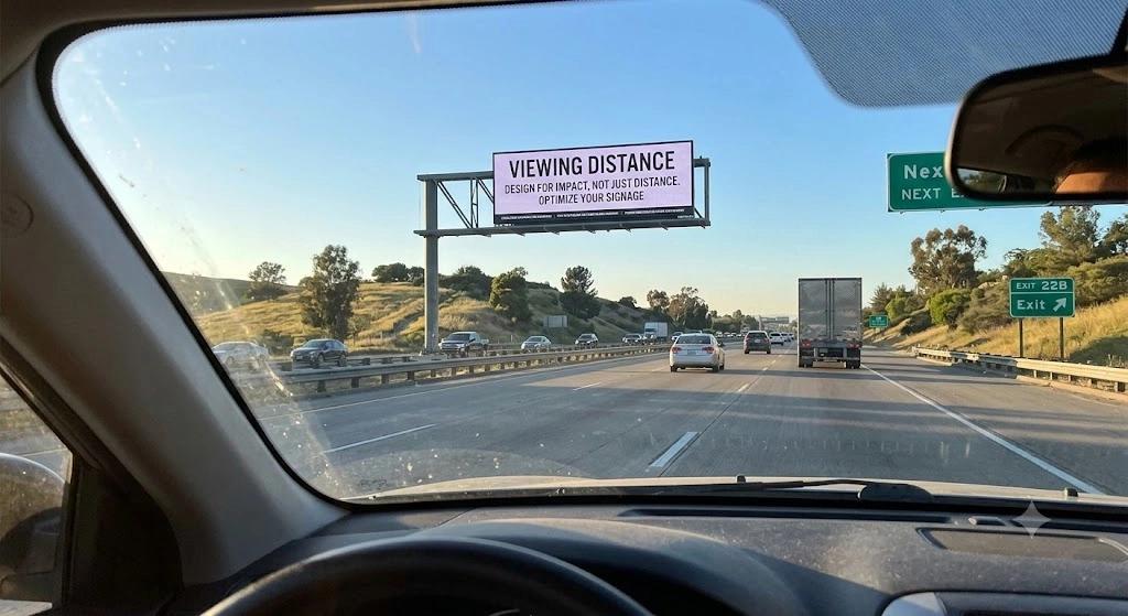
La pregunta útil no es:
¿A qué distancia puede alguien ver técnicamente la pantalla?
La pregunta útil es:
¿A qué distancia debe el espectador reconocer o leer el contenido importante?
Puede que sea necesario un cartel de acceso a la universidad para identificar el campus desde el otro lado de un aparcamiento. La entrada de un centro comercial puede necesitar mostrar su nombre y logotipo desde el lado opuesto de una gran plaza. Un negocio en carretera puede necesitar ser reconocido antes de que un conductor llegue a la propiedad.
Son condiciones de proyecto diferentes incluso cuando los tres usan señales LED exteriores.
Movimiento del espectador
La siguiente variable es cómo el espectador se encuentra con el signo.
Un espectador puede ser:
- Moverse rápido en un vehículo
- Moviéndose más despacio a pie o en bicicleta
- Aproximarse gradualmente a través de una propiedad
- De pie o esperando en una posición relativamente fija
El movimiento afecta a la ventana de visualización práctica.
Un espectador rápido tiene menos tiempo para procesar la información. Un espectador más lento o fijo puede tener más tiempo para examinar el texto secundario o detalles gráficos.
Esta es una de las razones por las que la señalización de larga distancia no debería tratarse como sinónimo de la señalización dirigida al conductor.
Los conductores son un público habitual en largas distancias, especialmente en el caso de monumentos, pilones y señales de carretera, pero no son los únicos.
Tiempo de visualización disponible
El movimiento influye en el tiempo disponible para procesar el signo.
Una ventana de visualización corta generalmente favorece:
- Texto ampliado
- Mensajes más cortos
- Jerarquía visual más sencilla
- Reconocimiento rápido de logotipos
Una ventana de visualización más larga puede permitir:
- Más información
- Líneas de mensaje adicionales
- Gráficos más detallados
- Elementos de marca más complejos
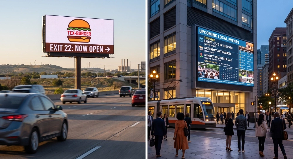
Sin embargo, El tiempo de visualización no sustituye la altura de los personajes.
Una persona que mira un cartel durante 20 segundos no adquiere automáticamente la capacidad de leer textos físicamente pequeños desde una larga distancia.
Un tiempo de visualización más largo simplemente da al espectador más oportunidades para procesar información que ya es visualmente resoluble.
La distancia sigue determinando cuán grande debe aparecer el contenido crítico.
Lectura vs. Reconocimiento
La última variable es la tarea que el espectador debe completar.
Lectura Significa entender el texto real.
Ejemplos incluyen:
- Un nombre comercial
- Un nombre de inquilino
- Un precio del combustible
- un breve mensaje direccional
- una línea de información cambiante
Reconocimientos significa identificar algo sin necesariamente leer cada elemento.
Ejemplos incluyen:
- un logo familiar
- una gran palabra
- Una identidad en el campus
- Un símbolo de marca reconocible
Estas tareas imponen diferentes exigencias al diseño de contenidos.
Un logotipo sencillo puede seguir siendo reconocible con relativamente pocos píxeles. Un logotipo que contenga curvas finas, letras internas, huecos estrechos o múltiples elementos pequeños puede requerir una resolución más nativa.
Por tanto, la señalización de larga distancia depende de un conjunto de condiciones de visualización:
Distancia + movimiento + tiempo de visualización + tarea de lectura o reconocimiento.
Esas condiciones deben definirse antes de que el pitch del píxel entre en la decisión.
2. Donde importan los mensajes de texto y logotipos a larga distancia
La legibilidad de texto y logotipo a larga distancia aparece tanto en proyectos de señalización orientada a carreteras como orientadas a propiedades.
El factor común no es el tipo de espectador.
Es la necesidad de identificación o comunicación a través de una distancia física significativa.
Aplicaciones orientadas a la carretera
Carteles de Monumentos Digitales
Los carteles digitales de monumentos se utilizan comúnmente en escuelas, iglesias, centros médicos, comunidades residenciales, propiedades corporativas y comercios.
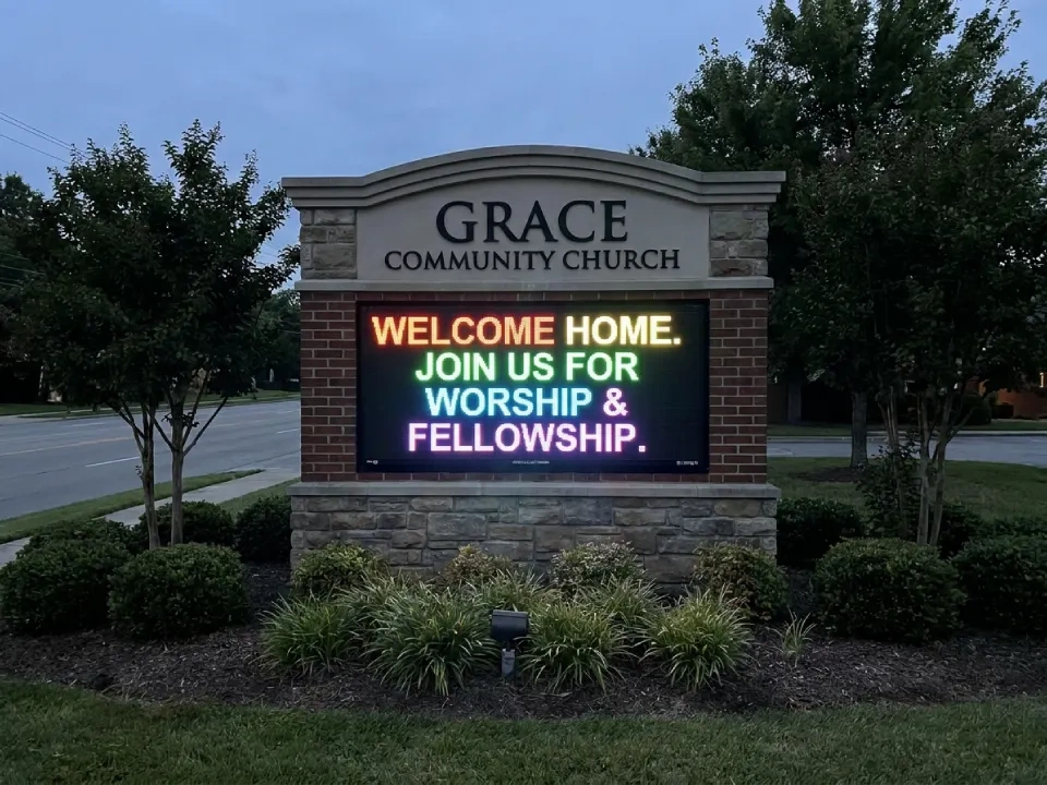
Pueden atender a varios públicos a la vez.
Un peatón podría ver primero el cartel desde el otro lado de un aparcamiento o acera. Un conductor puede encontrarse con el mismo cartel desde más lejos al acercarse a la entrada.
La estructura física del cartel puede limitar el área disponible de LED, mientras que el contenido aún debe llevar un nombre de propiedad, un logotipo y un mensaje cambiante.
Para una Inclinación de píxeles de los carteles de monumentos que crea un importante intercambio:
¿Cuántos detalles de texto y logotipo deben caber en el área física disponible?
Si el área activa está restringida, una densidad adicional de píxeles puede ayudar a preservar el texto más pequeño o detalles gráficos más finos.
Carteles de pilones
Los carteles de pilones suelen operar a una escala física mayor.
Pueden identificar centros comerciales, plazas comerciales, propiedades comerciales, lugares de viaje o desarrollos con varios inquilinos.
Como el propio cartel puede ser físicamente grande, los caracteres importantes también pueden hacerse grandes.
Pero el contenido multi-inquilino introduce otra limitación.
Cada nombre adicional de inquilino o línea de mensaje reduce el espacio físico disponible para cada contenido.
Para una Inclinación del píxel del signo del pilón Por tanto, debe evaluarse junto con:
- Dimensiones totales de pantalla activa
- número de filas de contenido
- Longitud del nombre del inquilino
- Complejidad del logotipo
- Condiciones previstas para ver
Un signo grande no elimina automáticamente la necesidad de una densidad de píxeles suficiente.
Carteles de negocios en carretera
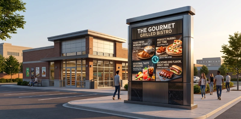
Restaurantes, hoteles, concesionarios de automóviles, empresas de servicios y otras propiedades junto a la carretera suelen utilizar señalización de larga distancia para su identificación temprana.
El contenido crítico puede incluir:
- Nombre comercial
- Logotipo de la marca
- Oferta corta
- Información de entrada
- Texto direccional
Para los espectadores que conmuevan, la simplicidad del contenido suele importar tanto como la resolución.
Un símbolo más grande o en negrita puede comunicar de forma más eficaz que intentar colocar demasiada información en la misma área de visualización.
Aplicaciones orientadas a propiedades y destinos
Carteles del campus e instituciones
Universidades, hospitales, campus corporativos, instalaciones públicas y otras grandes propiedades pueden necesitar que los visitantes reconozcan una entrada o destino desde una distancia considerable.
El espectador puede estar conduciendo, caminando, en bicicleta o moviéndose por un aparcamiento.
Un cartel del campus podría necesitar mostrar:
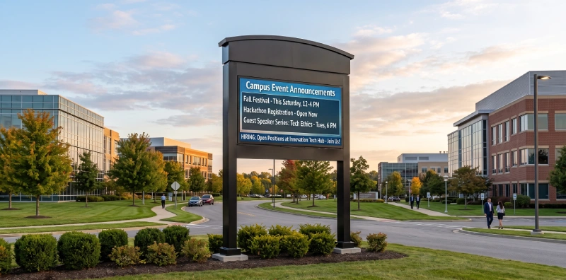
NOMBRE DE LA UNIVERSIDAD + LOGOTIPO
Un centro médico puede necesitar:
NOMBRE DEL HOSPITAL + IDENTIFICACIÓN DE ENTRADA
Estas siguen siendo aplicaciones de texto y logotipos a larga distancia incluso cuando el espectador no está en un vehículo.
El requisito importante es que el contenido sea útil antes de que el espectador llegue al cartel.
Centro comercial y grandes entradas de propiedades
Las grandes propiedades comerciales también pueden tener enfoques visuales largos.
Un peatón que cruce una plaza o zona de aparcamiento puede ver el nombre del centro comercial a 100–200 pies de distancia. Un conductor puede encontrarse con la misma señal desde más adelante en la carretera de acceso.
Esto convierte al cartel en una aplicación para audiencias mixtas.
La pantalla puede necesitar ambos:
- reconocimiento inmediato de la marca desde más lejos
- Información adicional para los espectadores que sigan acercándose.
Esa condición de visualización mixta puede hacer que la jerarquía de contenido sea especialmente importante.
El texto principal grande y un logotipo reconocible deben soportar la tarea de identificación a larga distancia, mientras que el contenido secundario puede tener una prioridad visual menor.
En todas estas aplicaciones, la cuestión del diseño sigue siendo la misma:
¿Qué hay que reconocer o leer, desde qué distancia, dentro de qué área de signos físicos?
3. Distancia de visualización, movimiento del público y altura de los personajes
Una vez que se entiende la aplicación, la primera decisión técnica de diseño es el tamaño físico del contenido.
El pitch del píxel sigue llegando después.
Una secuencia práctica es:
La distancia de visualización → el movimiento del público → el tiempo disponible → la altura requerida de los personajes.
Paso 1: Definir la distancia crítica de visión
Empieza por el punto en el que el signo necesita ser útil.
Por ejemplo:
- ¿Cuándo debería hacerse reconocible el nombre de la propiedad?
- ¿A qué distancia debe volverse legible el texto principal?
- ¿Cuándo necesita un espectador la información para tomar una decisión directa?
- ¿Qué punto de aproximación representa el requisito real de diseño?
Un proyecto puede tener varias posiciones posibles para ver el proyecto.
El objetivo es identificar el que importa para la tarea de comunicación.
Paso 2: Define el movimiento de audiencia
A continuación, considera si el espectador crítico es:
- Rápido
- Movimiento lento
- Acercándose gradualmente
- Estacionario
Esto influye en la cantidad de información que se puede procesar de forma realista.
Un espectador rápido puede tener tiempo solo para reconocer un logo y una línea corta.
Un peatón que se acerque a través de una propiedad grande puede tener tiempo para examinar información secundaria tras identificar el cartel principal.
Un espectador fijo puede pasar aún más tiempo con el contenido.
Esto afecta Cantidad de contenido y jerarquía, pero no elimina la necesidad de un tamaño adecuado de personaje.
Paso 3: Estimar la altura requerida del carácter
El texto crítico aún debe ser físicamente lo suficientemente grande para la distancia requerida.
Para la planificación temprana, una regla general común en el diseño de signos es aproximadamente 1 pulgada de altura de carácter por cada 25–30 pies de distancia de visión. Esto es útil para las comprobaciones iniciales de diseño, pero no debe tratarse como una fórmula de legibilidad garantizada.
Por ejemplo:
| Requisito de visualización | Ejemplo de altura de carácter planificada |
| Unos 150 pies | aproximadamente entre 18 y 20 cm |
| Unos 300 pies | aproximadamente entre 10 y 12 pulgadas |
| Unos 500 pies | aproximadamente entre 16 y 18 pulgadas |
| Unos 750 pies | aproximadamente 24 pulgadas |
La legibilidad real sigue dependiendo de la forma de la fuente, el ancho del trazo, el contraste, la longitud del mensaje, el ángulo de visión, las condiciones ambientales, el movimiento del espectador y el tiempo de visualización disponible. Por tanto, el tamaño final del personaje debe confirmarse en relación con el proyecto y el contenido reales.
Estas cifras deben tratarse como Guía de planificación en lugar de distancias de legibilidad garantizadas.
La legibilidad real depende de factores como:
- Forma de la fuente
- Ancho de carrera
- Diseño en mayúsculas o minúsculas
- Contraste
- Longitud del mensaje
- Ángulo de visión
- Condiciones ambientales
- Movimiento del público
- Tiempo de visualización disponible
La relación clave es más importante que cualquier número en particular:
A medida que aumenta la distancia de visualización requerida, el contenido crítico generalmente necesita hacerse físicamente más grande.
El tiempo de visualización cambia el contenido, no la física
Esta distinción es importante.
Un tiempo de visualización más largo puede hacer práctico mostrar más información.
No hace que un personaje físicamente pequeño sea repentinamente legible desde mucho más lejos.
Por ejemplo, un espectador fijo puede tener tiempo para leer:
- un nombre de propiedad
- Una línea secundaria
- Un mensaje direccional
Un espectador rápido puede tener tiempo solo para:
- un nombre grande
- Un mensaje breve
- Un logotipo reconocible
El requisito de altura de carácter sigue vinculado principalmente a la distancia de visión y a la forma visual.
El tiempo de visualización influye en la cantidad de contenido que debe presentarse al alrededor.
La altura del carácter conecta la distancia con el paso del píxel
Una vez establecido el tamaño físico del texto, el tono de píxeles se vuelve medible.
Supongamos que un proyecto requiere un carácter crítico de 18 pulgadas.
Ahora el estimador puede preguntar:
¿Cuántos píxeles construirán ese personaje de 18 pulgadas en P6.67, P10 y P16?
Ese es el puente entre las condiciones de visión y la resolución LED.
4. Tono de píxeles, matriz de píxeles y detalle de contenido
El tono de píxeles determina lo cerca que están los píxeles de los LEDs.
Para el diseño de signos, el significado práctico es simple:
Un tono de píxel menor proporciona más píxeles dentro de la misma área física.
Esa es la forma correcta de entender la diferencia entre P6.67, P10 y P16.
Un pitch más pequeño sí no automáticamente significa una distancia de visión más larga.
Comparar el mismo carácter físico
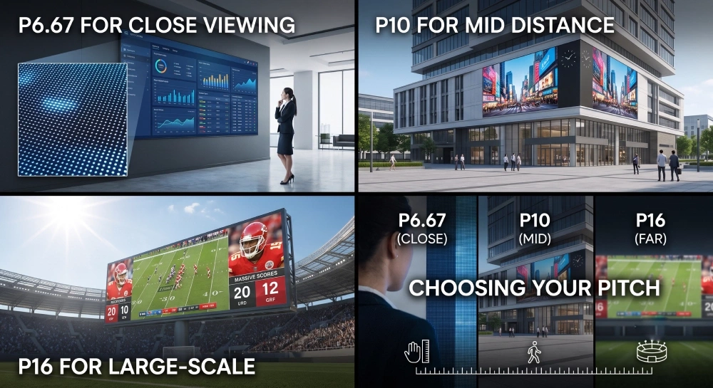
Toma un personaje de 18 pulgadas.
Una altura de 18 pulgadas es aproximadamente de 457 mm.
Dividir esa altura por cada pitch de píxel candidato da un recuento aproximado de píxeles verticales:
| Pitch de píxeles | Aprox. Pitch en pulgadas | Aproximadamente píxeles en un carácter de 18" |
| P6.67 | 0,263 in | 68 px |
| P10 | 0,394 in | 46 px |
| P16 | 0,630 in | 29 px |
El carácter físico sigue midiendo 18 pulgadas de alto en los tres casos.
Lo que cambia es la cantidad de detalles digitales disponibles en su interior.
P6.67: Más píxeles en espacio limitado
En P6.67, el mismo carácter físico contiene aproximadamente 68 píxeles verticales.
Eso puede ayudar cuando el proyecto necesita:
- Curvas de carácter más finas
- Texto de apoyo más pequeño
- Más líneas de mensaje
- Logotipos detallados
- gráficos más ricos
- Más información dentro de un área activa restringida
Aquí es donde una mayor densidad de píxeles crea valor práctico.
La ventaja no proviene de que el espectador sea peatón ni de que la distancia de visión sea más corta.
Surge de que el contenido requiere más detalle dentro del mismo espacio físico.
P10: Densidad moderada de píxeles
En P10, el mismo carácter de 18 pulgadas contiene aproximadamente 46 píxeles verticales.
Esto puede soportar muchas aplicaciones donde:
- El texto grande es el elemento principal de comunicación
- Los logotipos tienen una complejidad moderada
- La pantalla tiene suficiente área física
- El contenido no necesita detalles extremadamente finos
El P6.67 vs P10 Por tanto, la decisión debería centrarse en si el texto y los gráficos reales se benefician visiblemente de la densidad adicional.
Si el contenido importante ya se renderiza eficazmente en P10, píxeles adicionales pueden contribuir menos a la tarea principal de comunicación.
P16: Menor densidad, mayor contenido físico
En P16, el mismo carácter de 18 pulgadas contiene aproximadamente 29 píxeles verticales.
Eso limita el detalle fino más que P6.67 o P10.
Sin embargo, un signo físico grande también puede permitir que los caracteres sean mucho más grandes que 18 pulgadas.
Un logotipo muy grande, un precio, un símbolo simple o un logotipo en negrita pueden tener suficientes píxeles totales porque el contenido físico ocupa un área mayor.
Por eso P16 puede seguir siendo adecuado para algunos proyectos de larga distancia sin soportar el mismo nivel de detalle visual que un pitch más fino.
La resolución completa de signos también importa
La altura del carácter es solo una parte del cálculo.
También es necesario convertir toda la zona activa en un nativo Matriz de píxeles de resolución de signos LED.
Por ejemplo, tomemos una pantalla activa de 3200 mm × una de 3200 mm.
Su matriz nativa aproximada sería:
| Pitch de píxeles | Matriz nativa aproximada |
| P6.67 | 480 × 480 px |
| P10 | 320 × 320 px |
| P16 | 200 × 200 px |
El tamaño físico del signo se mantiene igual.
El recuento total de píxeles cambia sustancialmente.
En la misma zona física:
- P6.67 contiene aproximadamente 2,25× el total de píxeles de P10
- P10 contiene aproximadamente 2,56× el total de píxeles de P16
- P6.67 contiene aproximadamente 5,76× el total de píxeles de P16
Esas relaciones lo explican P6.67 vs P10, P10 vs P16, y P6.67 vs P16 más preciso que asignar cada nota a una categoría de distancia fija de visualización.
La complejidad del contenido determina si la densidad aporta valor
Una mayor densidad de píxeles se vuelve útil cuando el contenido realmente puede usarla.
Considera dos señales de larga distancia.
Se necesita:
NOMBRE DEL HOTEL + logo sencillo
Las otras necesidades:
NOMBRE DE LA UNIVERSIDAD + escudo detallado + línea secundaria
Incluso si las dimensiones físicas del signo son similares, el segundo diseño puede aprovechar más la densidad adicional de píxeles porque es necesario que encajen más información visual en la misma área.
El mismo principio se aplica al tiempo de visualización.
Una audiencia que se mueve rápidamente suele beneficiarse de:
texto grande + logotipo simple + mensaje corto
Una audiencia más lenta o estacionaria puede tener tiempo para procesar:
Información adicional + gráficos más detallados + contenido secundario
Un tiempo de visualización más largo no requiere por sí solo una afinación más fina.
Simplemente hace que el contenido más rico sea más práctico, lo que puede aumentar el valor de la densidad adicional de píxeles si ese contenido necesita más detalle.
Prueba el logotipo y el texto reales
Un logotipo debería probarse en la matriz nativa real en lugar de juzgarse solo a partir de arte vectorial.
Los logotipos simples pueden seguir siendo reconocibles con un número relativamente bajo de píxeles.
Los logotipos complejos que contienen huecos estrechos, letras pequeñas, curvas finas o múltiples elementos internos pueden perder características importantes a medida que la matriz nativa se vuelve más gruesa.
Lo mismo ocurre con el texto.
La pregunta útil no es:
¿Qué pitch tiene más píxeles?
Es:
¿La densidad adicional de píxeles conserva la información que importa para este proyecto?
5. Elegir P6.67, P10 o P16
La selección final debe combinar tres grupos de información:
Condiciones de visualización + tamaño físico del signo + requisitos de contenido.
Esto es más útil que asignar un solo lanzamiento a una distancia de visualización.
Cuándo puede ser apropiado P6.67
P6.67 se vuelve más relevante cuando:
- El área física del signo es relativamente limitada
- Los personajes críticos no pueden hacerse muy grandes
- Varias líneas de información deben encajar
- El logotipo contiene detalles más finos
- La información secundaria es importante
- El mismo cartel puede verse tanto desde lejos como desde posiciones más cercanas
- El contenido se beneficia visiblemente de una mayor resolución nativa
Su valor proviene de poner más píxeles en el área física disponible.
Cuándo puede ser apropiado P10
P10 puede ser un ajuste fuerte cuando:
- El texto grande transporta la mayor parte de la comunicación
- Las distancias de visualización son considerables
- El logotipo tiene un nivel de detalle moderado
- El área de señal activa le da al contenido suficiente tamaño físico
- El proyecto necesita un equilibrio práctico entre resolución y escala de visualización
- el texto y los gráficos previstos ya se renderizan claramente en la matriz nativa del P10
P10 debe evaluarse a través de las dimensiones reales de la obra y el cartel, en lugar de tratarse como un lanzamiento genérico de "media distancia".
Cuándo puede ser apropiado P16
P16 se vuelve más relevante cuando:
- El signo es físicamente grande
- Los personajes importantes también pueden hacerse muy grandes
- El contenido es principalmente texto en negrita
- Los logotipos son simples y reconocibles
- La densidad de información es baja
- La aplicación prioriza la identificación a gran escala sobre el detalle gráfico fino
Su idoneidad proviene de la escala física del contenido, no de una norma que diga que P16 pertenece automáticamente a largas distancias de visualización.
Comparar las condiciones del proyecto
Una comparación útil es la siguiente:
| Estado del proyecto | P6.67 suele añadir más valor | P10 suele encajar | P16 May Fit |
| Área física activa limitada | Fuerte | Moderado | Más restringido |
| Texto crítico más pequeño | Fuerte | Es posible dependiendo de la distribución | Más restringido |
| Logotipo detallado | Fuerte | Moderado | Lo mejor con arte simplificado |
| Múltiples líneas de mensaje | Fuerte | Moderado | Limitado por matriz |
| Caracteres físicos grandes | Obras | Obras | Ajuste más fuerte |
| Contenido simple y en negrita | Obras | Fuerte | Fuerte |
| Signo físico muy grande | Obras | Fuerte | Fuerte |
| Alta densidad de información | Fuerte | Moderado | Inferior |
| Baja densidad de información | Obras | Fuerte | Fuerte |
Esta tabla no debe interpretarse como una regla fija.
Es una forma de conectar la densidad de píxeles con el contenido real y el diseño físico del cartel.
Empareja el pitch con una configuración de signo chipshow
Una vez definidas las condiciones de visualización, la altura de los caracteres y la densidad de píxeles requerida, el tono puede adaptarse a una configuración adecuada de Chipshow.
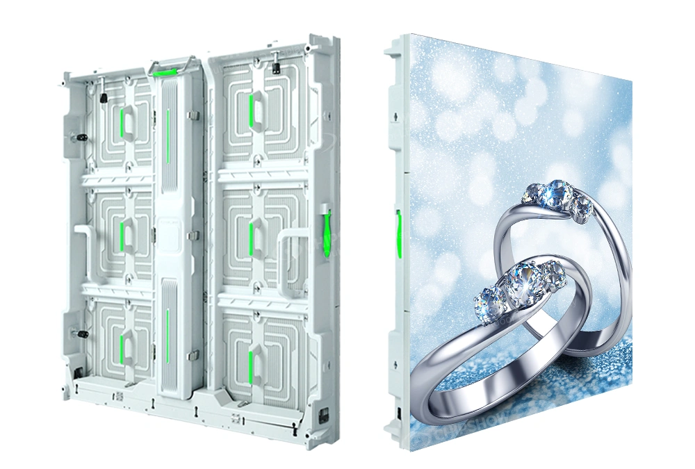
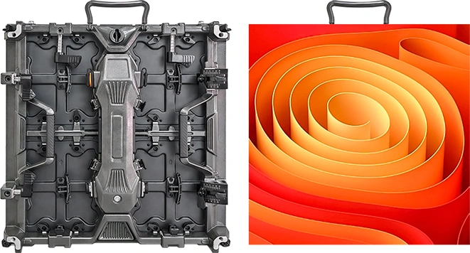
Para proyectos que requieren más detalle dentro de un área activa limitada, ambos C-Smart y C-Fit Easy puede considerarse para aplicaciones de señalización exterior P6.67. C-Smart puede soportar señalización comercial de formato más grande usando P10 u otras opciones de pitch adecuadas, mientras que C-Slim puede evaluarse cuando el proyecto requiere una solución completa de armarios exteriores.
La selección final debe basarse en las dimensiones reales del cartel, la disposición del contenido, la estructura de instalación y los requisitos del proyecto. Ver Chipshow's Soluciones para pantallas LED exteriores y Páginas de producto relevantes Para opciones de configuración.
6. Lista de verificación para la selección de señales de larga distancia
Antes de finalizar la presentación, un diseñador de señales o estimador puede resolver siete preguntas:
1.¿A qué distancia debe estar el mensaje crítico?
Define dónde el texto o logo debe ser útil.
2.¿Cómo se mueve el espectador?
Identifica si el público principal es rápido, lento, que se acerca gradualmente o que está quieto.
3.¿Cuánto tiempo de visualización está disponible?
Utiliza esto para determinar cuánta información debe presentar razonablemente el cartel.
4.¿Cuál es la altura requerida de un personaje?
Establece el tamaño físico del texto más pequeño antes de seleccionar el tono.
5.¿Qué tan complejo es el contenido?
Revisa los detalles del logo, el número de líneas de texto, la información secundaria y los requisitos gráficos.
6.¿Cuántos píxeles proporciona cada pitch candidato?
Calcula tanto píxeles por carácter como la matriz de signos nativa completa.
7.¿El pitch más fino resuelve un problema real de contenido?
Renderiza la obra real en P6.67, P10 y P16 y compara si la densidad adicional conserva detalles útiles.
7. Prueba el contenido real antes de citar
La comparación final de la presentación debe usar el texto y el logotipo reales del cliente.
Para un cartel de monumento, prueba el nombre de la propiedad, el logotipo y el mensaje de cambio más pequeño.
Para la entrada al campus, prueba el nombre de la institución, el logotipo y cualquier identificación secundaria.
Para un pilón multiinquilino, prueba varios nombres realistas dentro de las dimensiones físicas de visualización previstas.
Para un cartel de negocio en carretera, prueba el símbolo principal y el mensaje de alta prioridad más corto.
Esto hace que la decisión sea visible.
Una tabla de especificaciones puede mostrar que P6.67 contiene más píxeles que P10.
Un renderizado real de contenido muestra si esos píxeles extra realmente mejoran el logo o el texto que importa.
Para una RFQ, las entradas útiles incluyen:
- Ancho y altura de la pantalla activa
- Distancia crítica de visión
- Condiciones de movimiento del público
- Tiempo de visualización disponible
- la altura mínima requerida de carácter
- número de líneas de texto
- Arte real del logotipo
- Tipo de contenido previsto
- Pitches de píxeles candidatos
Con estas entradas, Chipshow puede evaluar la resolución nativa propuesta frente al requisito real de señal en lugar de seleccionar el tono solo desde la distancia de visión.
Conclusión
Elegir entre P6.67, P10 y P16 debe comenzar por las condiciones de visualización, no por una regla preestablecida de distancia a tono preestablecida. Define a qué distancia debe trabajar el texto o logo, cómo el espectador se encuentra con el cartel, cuánto tiempo de visualización está disponible, qué tamaño deben tener los personajes críticos y cuántos detalles visuales requiere el contenido. Luego compara el número de píxeles que proporciona cada pitch candidato dentro del tamaño real del carácter y las dimensiones del signo. P6.67 puede aportar valor cuando hay que encajar más información o detalles más finos en un espacio físico limitado, P10 puede adaptarse a muchos diseños de texto grande y detalle moderado, y P16 puede funcionar bien cuando la pantalla y el contenido son físicamente grandes y visualmente simples. Para una recomendación específica de un proyecto, Chipshow puede evaluar las dimensiones planificadas del signo, las obras de arte y los requisitos de visualización en función de la matriz de píxeles nativa.
FAQ
P1:¿La señalización LED de larga distancia solo significa señales orientadas al conductor?
No. La larga distancia describe la condición de visualización más que el tipo de audiencia. Los conductores suelen ser observadores de larga distancia para señales de monumentos, pilones y carreteras, pero los peatones y los que están parados también pueden necesitar reconocer señales del campus, institucionales, centros comerciales o grandes propiedades desde una distancia considerable.
P2:¿Es mejor P6,67 que P10 para señales de larga distancia?
P6.67 proporciona más píxeles dentro de la misma área física, lo que puede ayudar cuando texto más pequeño, logotipos detallados, múltiples líneas de mensaje o dimensiones restringidas de los signos requieren una resolución más nativa. No es automáticamente mejor para la visualización a larga distancia. Si el contenido físico ya es lo suficientemente grande y simple en P10, la densidad adicional puede aportar un beneficio práctico limitado.
P3:¿Es P16 adecuado para texto y logotipos?
P16 puede ser adecuado cuando el signo es físicamente grande y el contenido utiliza caracteres grandes, logotipos simples y una densidad de información relativamente baja. El texto más pequeño y los gráficos detallados se vuelven más limitados porque hay menos píxeles disponibles dentro de la misma área física.
P4:¿Cuántos píxeles debe tener una carta de signo LED?
No existe un recuento universal de píxeles que garantice la legibilidad. Empieza con la altura física requerida de caracteres, luego calcula los píxeles por carácter en cada tono candidato y renderiza la fuente y el mensaje reales a la resolución nativa propuesta.
P5:¿Significa un menor tono de píxeles una distancia de visión mayor?
No. Un pitch de píxel menor significa más píxeles dentro de la misma área física. La legibilidad a larga distancia depende en gran medida del tamaño físico del carácter, el diseño del contenido, el contraste, las condiciones de visualización y las dimensiones generales del cartel.
P6:¿Qué información debería proporcionar para un presupuesto de letrero LED?
Proporciona las dimensiones de visualización activa, la distancia crítica de visualización, las condiciones de movimiento del público, la altura mínima importante de los caracteres, el número de líneas de texto, el logotipo, el contenido previsto y cualquier propuesta candidata que ya esté considerando. Estas entradas permiten comparar la matriz de píxeles nativa con la aplicación real.
¿No estás seguro de qué formato o tono de píxel se adapta a tu proyecto? Prueba el Chipshow Selector de señales LED de EE. UU. para preseleccionar opciones.