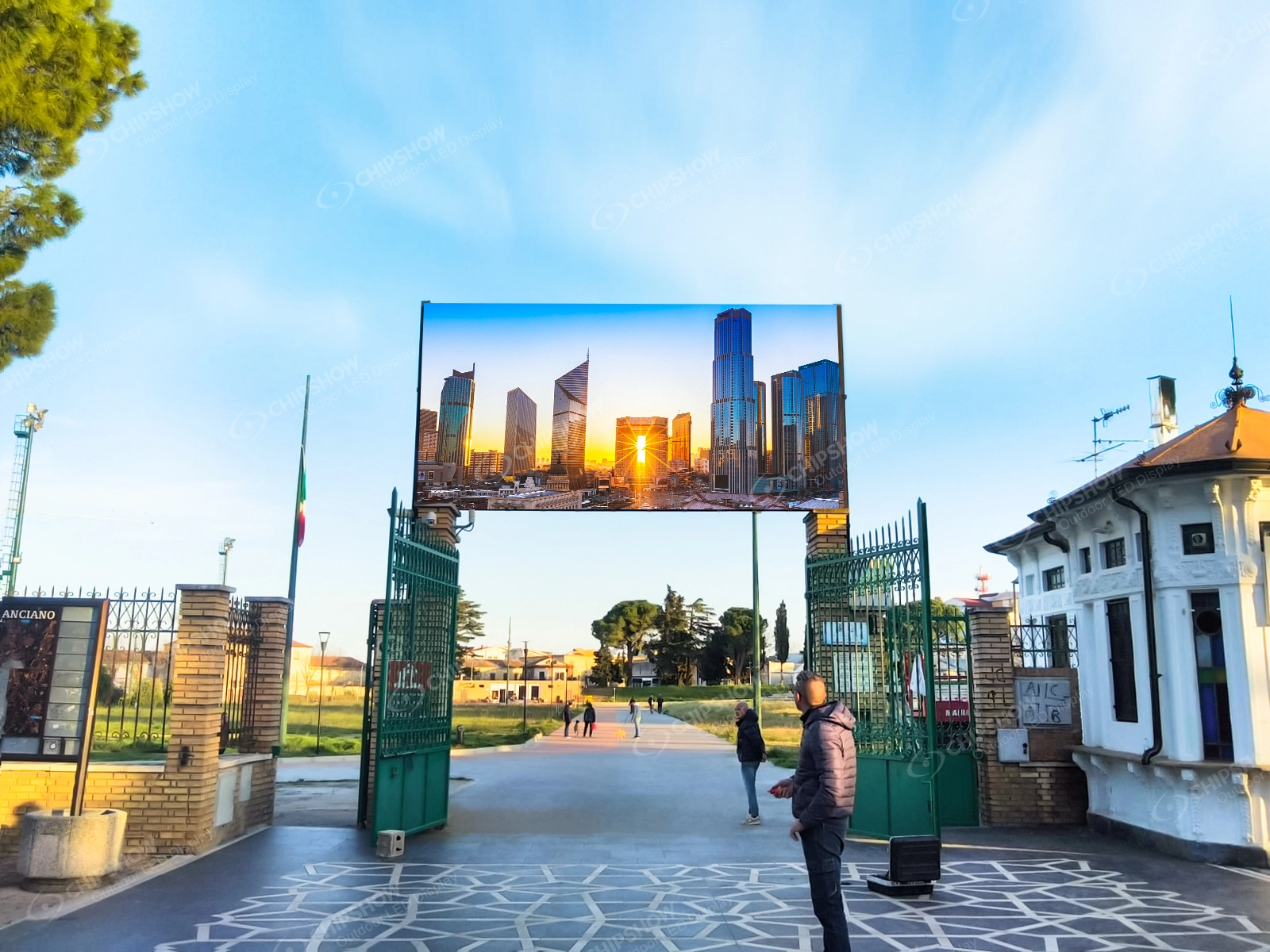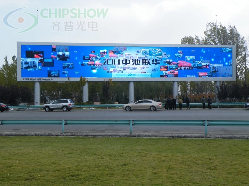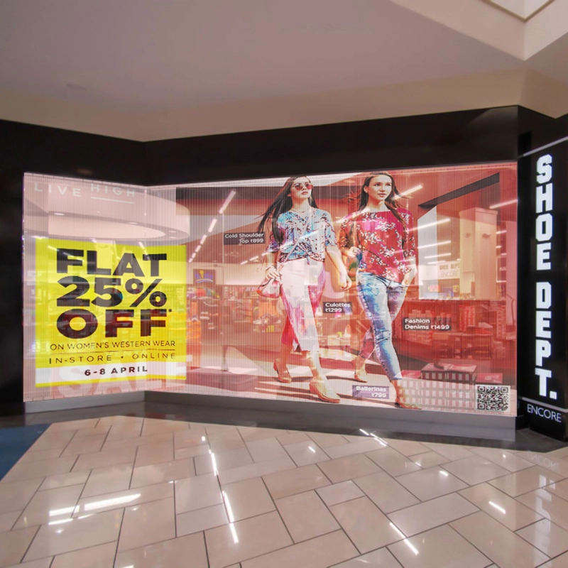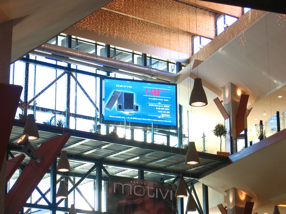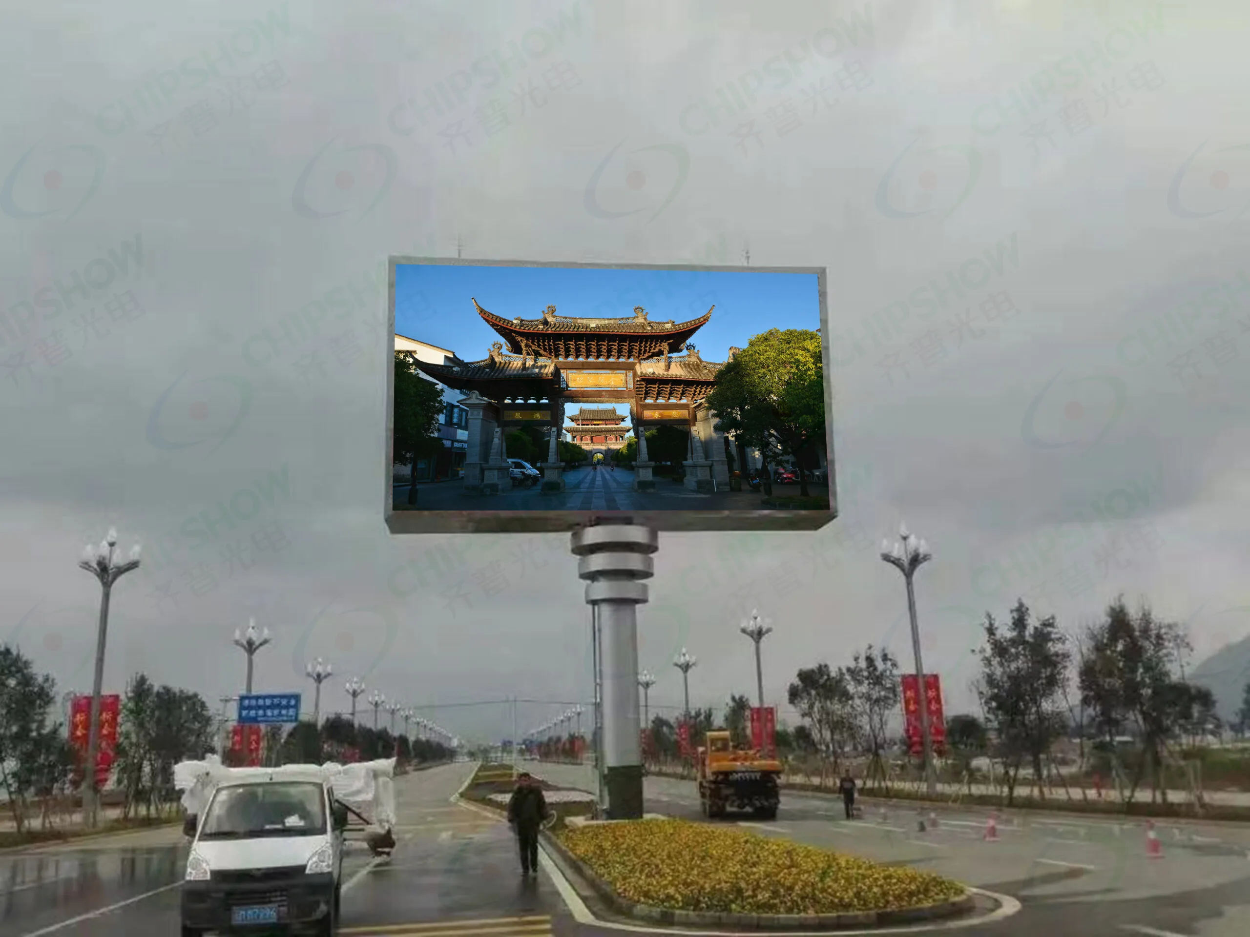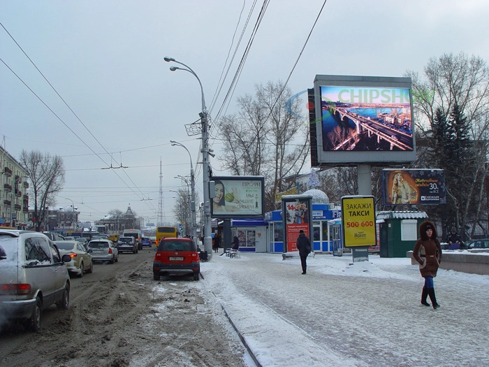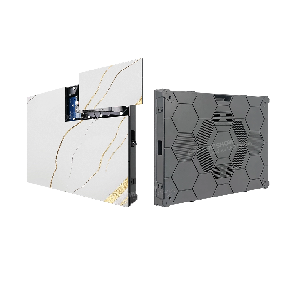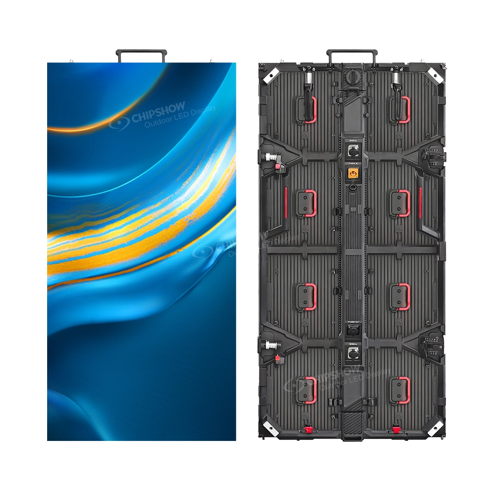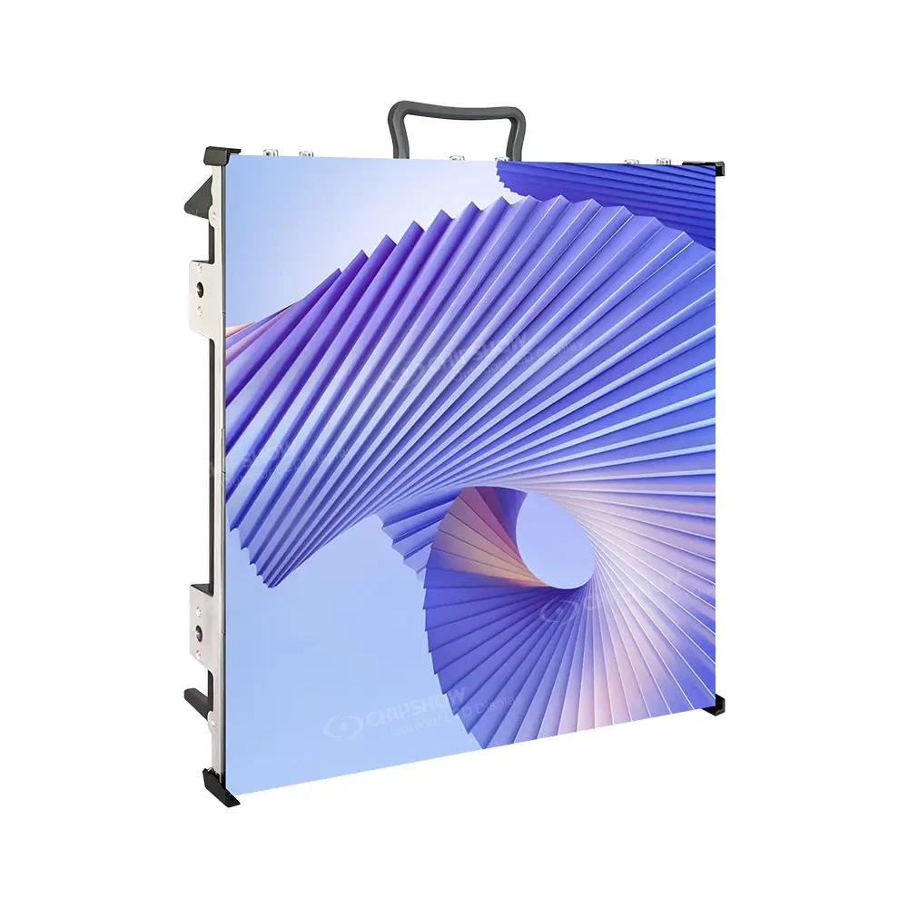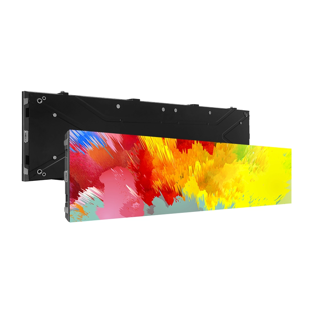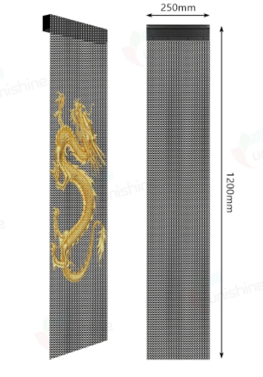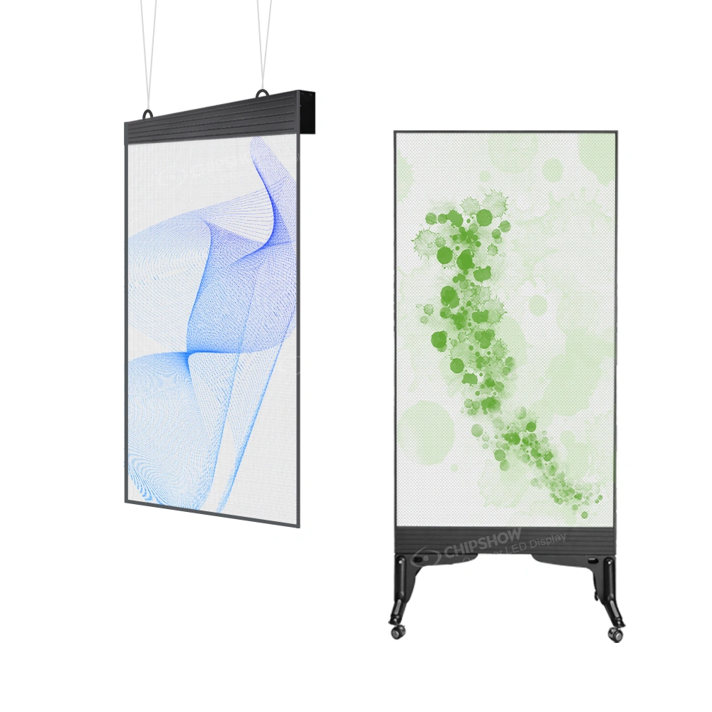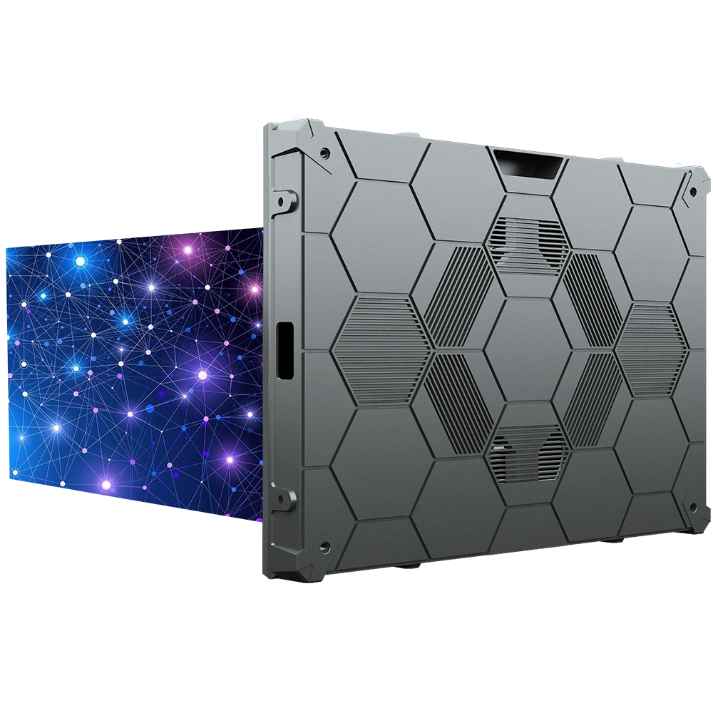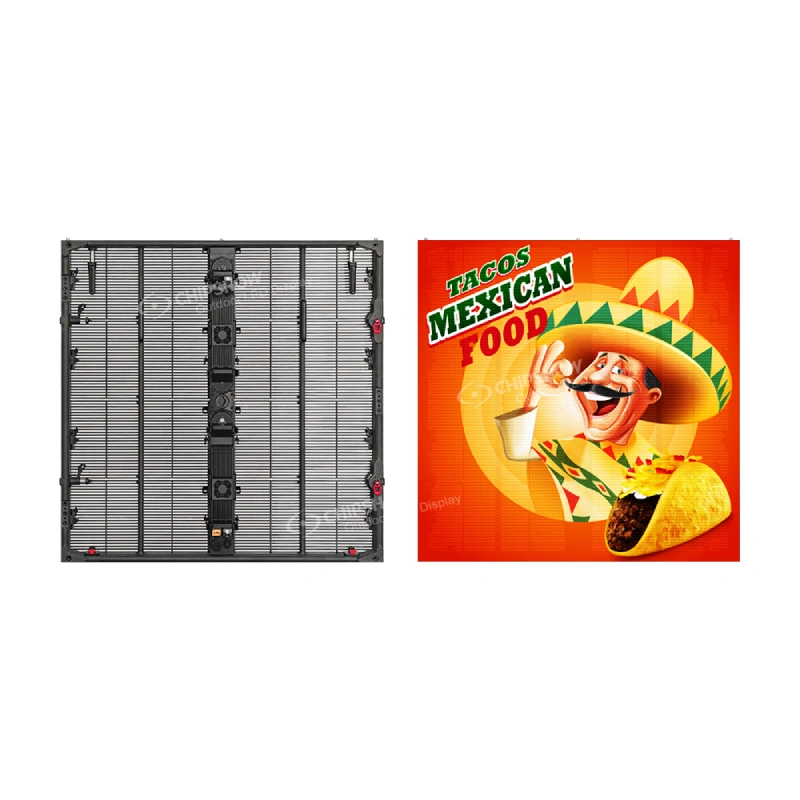
In North American retail environments, an LED ribbon display can turn a long, shallow architectural area into a useful communication surface without occupying the merchandise or circulation space below it. Typical opportunities include shopping-center entrances, big-box aisle headers, checkout bands, right-angle transitions and square pillars beside major shopper routes.
The right location depends on what customers need at that point in the store. An entrance may need one short campaign message that can be read while approaching. An aisle header may need category information that stays connected to the merchandise below. A checkout band may carry concise service or promotion messages while customers wait. This guide explains how to choose among those locations and when to use a straight run, a 90-degree configuration or selected pillar faces.
Map the Shopper Route Before Choosing a Location
Walk the retail environment in the same order as a customer. Mark where people enter, slow down, search for a department, turn into an aisle, wait for service and leave. Then record the direction from which each proposed display location is normally seen and the message customers need there.
This walk-through turns a general request for “digital signage” into location-specific decisions. A shopping-center entrance band can address customers before they enter. A header above a big-box aisle can keep category information connected to a long merchandise run. A square pillar at the meeting point of two routes may need two adjacent display faces, while its rear faces add little value.
Record the location, usable width and height, primary viewing direction, approximate viewing distance and intended message. These details show whether a ribbon format fits the task and give the integrator a practical basis for developing the layout.
Use an Entrance Band for Approach Messages
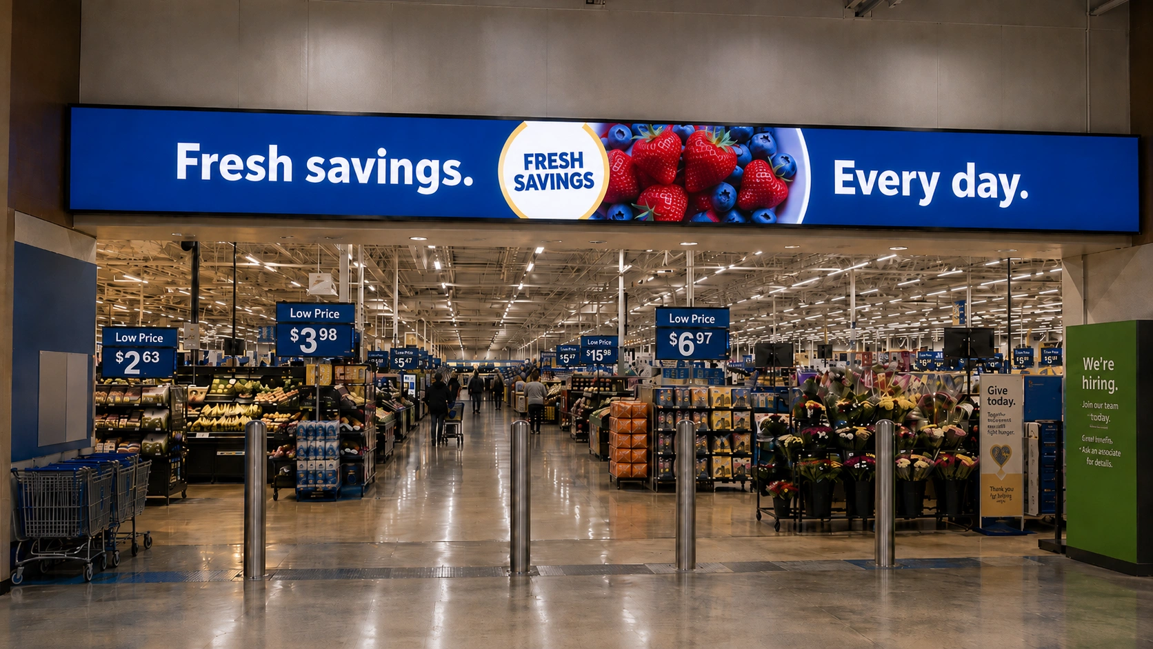
A retail entrance often has a narrow band above the doorway, below a soffit or between existing architectural elements. Customers approach from a distance, so the display has a clear job: establish the brand, announce a short campaign or direct people before they cross the threshold.
This is a strong ribbon-display location when the space below must remain open and the message can be delivered with large text, a brand graphic or a simple horizontal animation. The display follows the entrance rather than occupying merchandise space beside it.
Imagine a seasonal campaign at the entrance to a shopping-center store. A large campaign name and one clear visual can remain readable from the concourse. A detailed product comparison or a complete 16:9 commercial would be a poor fit because the narrow canvas would crop the video or reduce the full frame until its details are difficult to read.
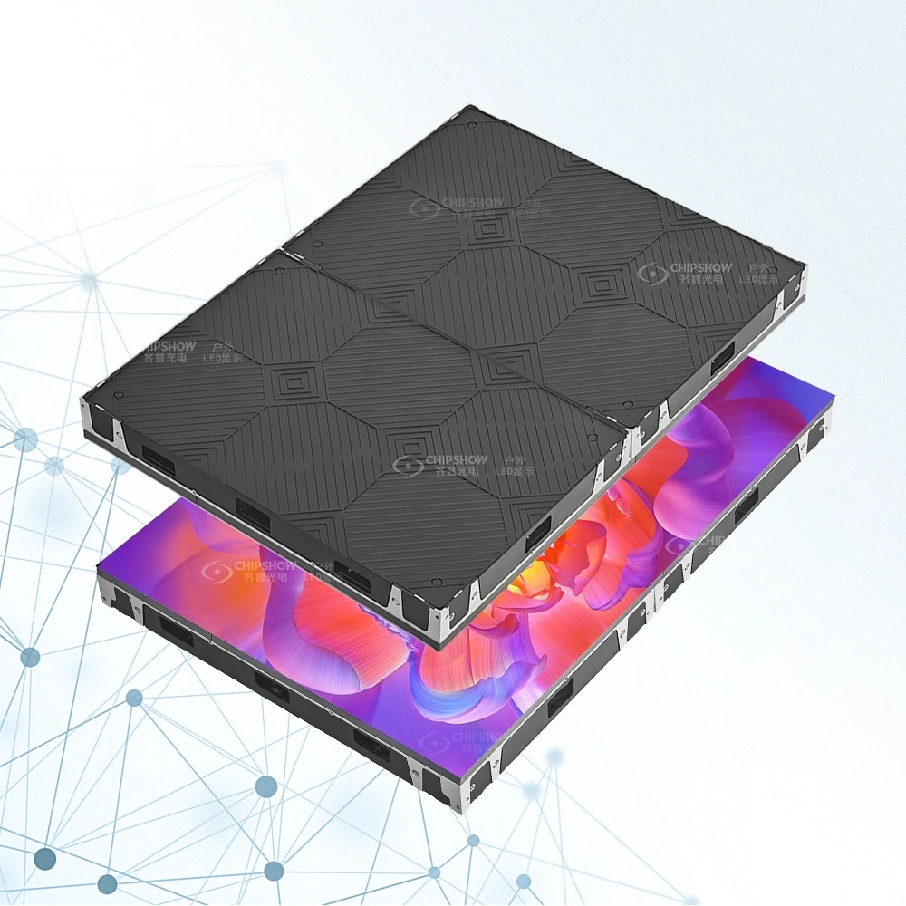
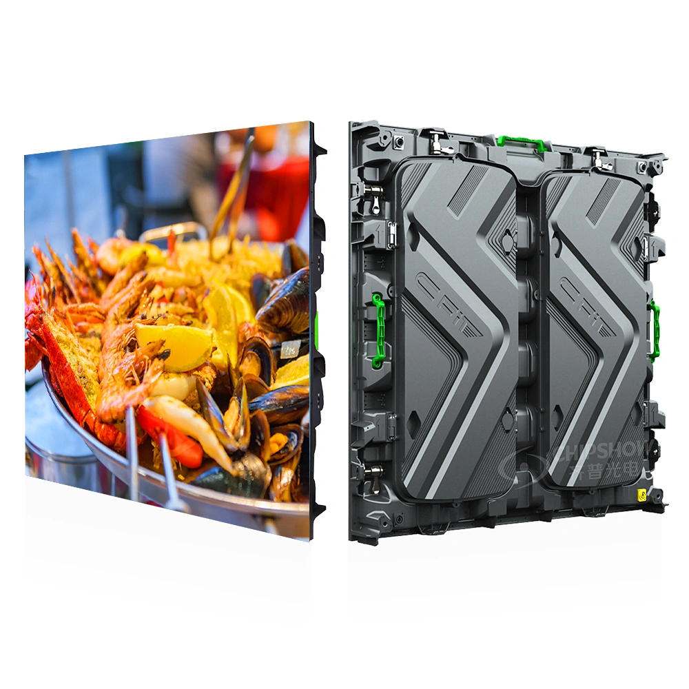
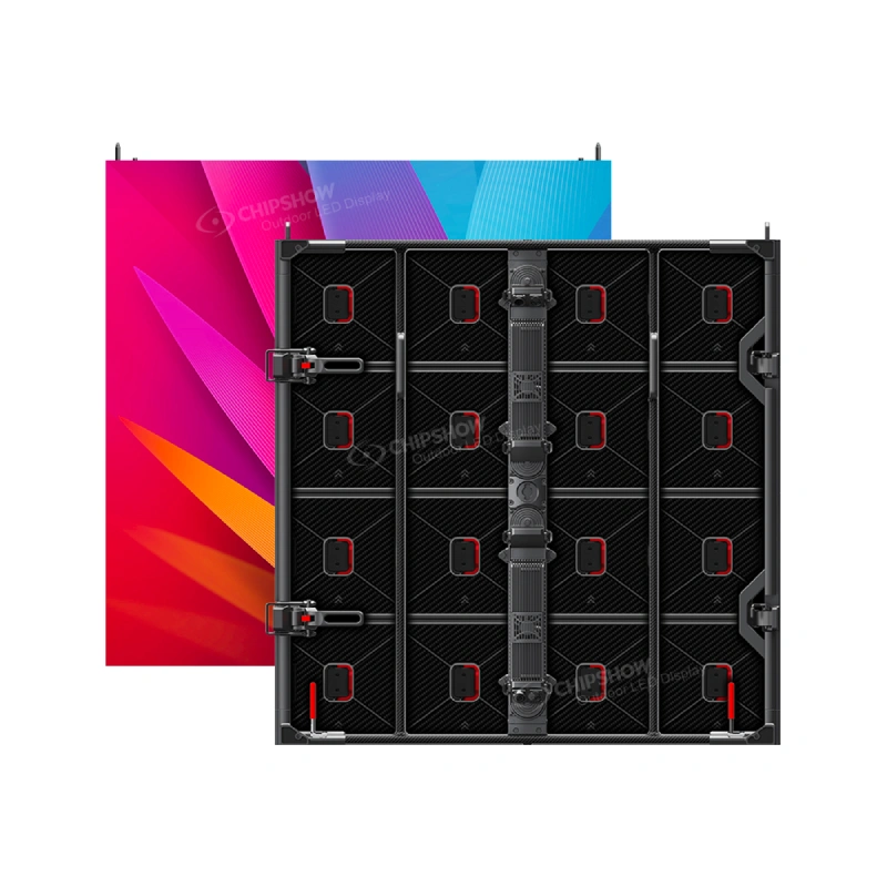
For a straight entrance band, the C-Max-C format provides a verified 250 mm (9.84 in) cabinet height with 1000, 750 and 500 mm (39.37, 29.53 and 19.69 in) width options. Those widths give the integrator several standard building blocks for the measured opening. They do not guarantee that every arbitrary entrance length can be filled exactly; the finished length, end treatment, pitch and cabinet combination still need project confirmation.
If the entrance band continues onto an adjacent wall, use a corner only when the same visual must follow that turn. A decorative 90-degree connection adds little when the two faces will always carry unrelated messages.
Connect Aisle-Header Content to the Merchandise Below
An aisle header is useful when the store needs changing information above a long merchandise run but cannot give up the shelf or floor space below. It can identify departments, mark product categories or place a short promotion directly above the relevant merchandise.
Consider a big-box store with several categories along one long aisle. Instead of placing every category name at the entrance to the aisle, divide the ribbon into content zones that match the sections below. A shopper standing near seasonal goods sees the seasonal message in that zone; a shopper farther along sees the category relevant to that section. The display becomes part of wayfinding rather than a disconnected advertising strip.
Use a ribbon format when messages are short and horizontal and when updates need to follow the merchandise zones. Choose a taller display when the content depends on full product images, several lines of comparison text or standard-format video. Keep existing printed or static signs when the categories rarely change and those signs are already clear from the shopper route.
Compare a Checkout Ribbon with a Conventional Display
Checkout and service areas require a different decision because customers may wait rather than walk past. In a grocery store, warehouse club or customer-service queue, that dwell time can support a short sequence of messages rather than a single approach message.
Choose the ribbon route when the only practical display area is a shallow band above checkout lanes, a customer-service counter or a queue. It can carry lane information, a short membership reminder, a service message or one promotion at a time while keeping the area below open.
Choose a conventional display when customers face a complete wall and need to see product images, a full video, several service steps or detailed instructions. The taller canvas gives that information room to breathe. Installing a longer but shallower screen would create a special content format without solving a space restriction.
A useful test is to sketch the smallest message that must appear during normal operation. If it needs several lines, multiple images and fine terms in one view, the location probably needs a taller display or a simpler communication plan. Selecting a finer pitch cannot fix a canvas whose shape is wrong for the information.
Use Corners Only When the Audience or Image Continues Around Them
A right-angle corner can make the display visible from two directions, but there are two very different reasons to use those faces.
Continue One Image Across Two Walls
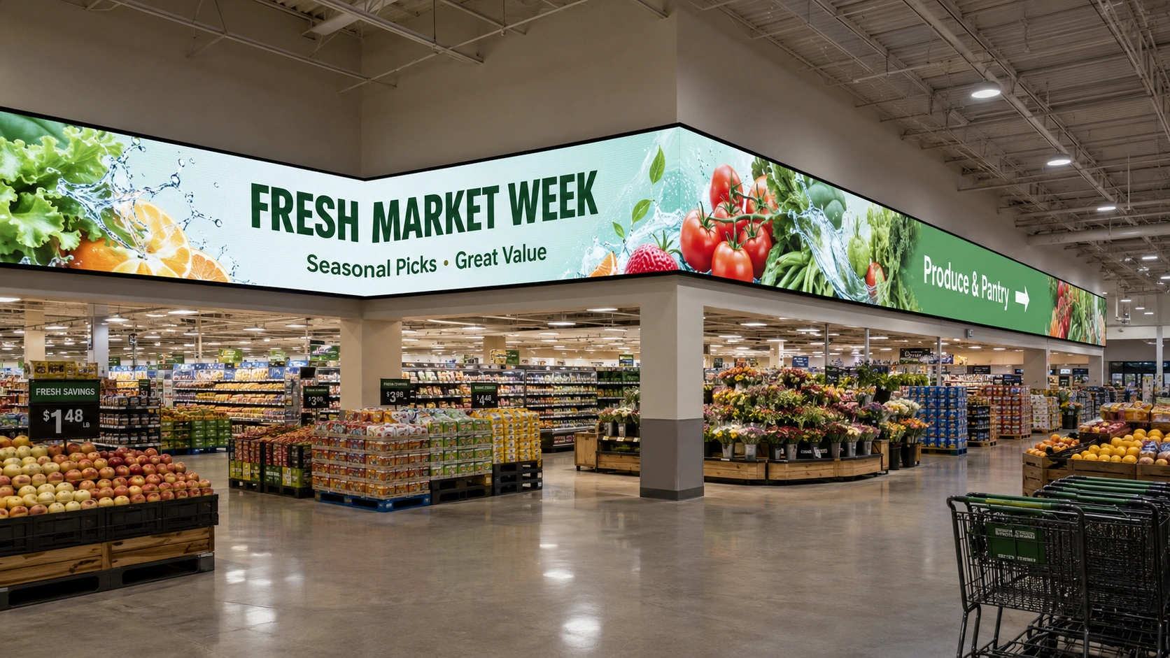
Choose a continuous corner when a campaign graphic or animation must move from one wall onto the next. This can work beside an entrance, at the end of an aisle or where shoppers turn into a new retail zone. The corner is valuable because it preserves one visual journey as the customer changes direction.
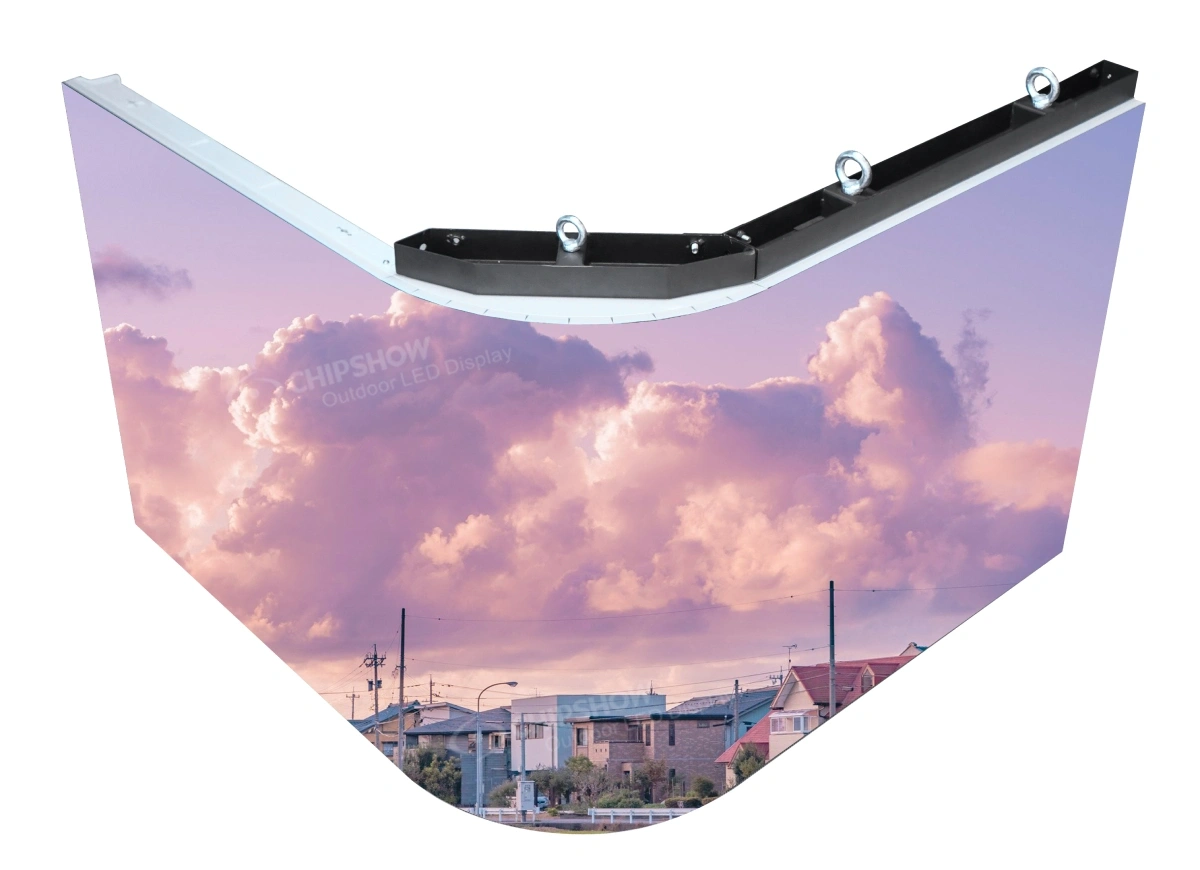
The current C-Max-C configuration lists 45-degree beveled cabinet edges for 90-degree corners. In this scenario, the verified feature supports a connected right-angle route instead of forcing the campaign to stop at two flat rectangles. The inside or outside corner direction, active-face widths, selected pitch and exact corner components must still be confirmed.
Keep important text and product detail away from the fold unless an actual-scale test shows that they remain clear. The corner can carry motion through the turn, while the main message sits on a face that customers see more directly.
Give Each Direction Its Own Message
Use independent content faces when the audiences have different needs. The approach side of a store might announce a campaign, while the exit-facing side carries a membership reminder. Those messages do not need to travel through the corner merely because the cabinets connect physically.
In this case, the integrator can still evaluate a right-angle display, but the content map should mark two independent zones. Also compare two separate displays if they make installation and content control clearer. Continuous hardware should earn its place by improving the customer journey, not by making the rendering look more complex.
Select Pillar Faces from Shopper Traffic
The number of display faces on a square pillar should follow the number of useful shopper approaches. If a pillar faces one main walkway, a single active face may be enough. If it sits where an entrance route meets a cross-aisle, two adjacent faces can address both directions through a 90-degree configuration. More faces are useful only when additional sides have their own visible audience and communication task.
For example, consider a pillar between a shopping-center entrance and a store’s main aisle. The entrance-facing side can introduce the current campaign, while the adjacent aisle-facing side identifies the department ahead. A rear side blocked by fixtures does not need display hardware or a separate content zone simply to complete a four-sided wrap.
The C-Max-C right-angle configuration can support adjacent faces of a square pillar, subject to confirmation of the cabinet combination, corner components and content mapping. Round columns, cylindrical displays and other curved or custom shapes require a different product route.
Match Pixel Pitch to the Message and Viewing Position
Pixel pitch should be selected with the exact message that will appear at each location. The current C-Max-C product information lists P2.5, P2.6, P2.97 and P3.91, but the useful comparison changes with the content and the shopper’s position.
At a shopping-center entrance, the ribbon may show a large brand name followed by a short message such as “SUMMER SALE.” Shoppers see it while approaching from the concourse, and the content contains no small product description. Compare candidate pitches from the point where the message first needs to be readable. If the brand letters and main graphic look equally clear at that position, a finer pitch adds pixels without improving the entrance message.
Above a big-box aisle, the content may alternate between a department name such as “HOME STORAGE” and a directional message such as “CUSTOMER PICKUP →.” Customers can stand much closer to this display, and the lettering must remain clear across a shallow content zone. If a coarser option breaks the thinner letter strokes or makes the arrow and wording harder to recognize from the aisle, compare a finer pitch. Here, the finer option solves a visible wayfinding problem rather than simply improving the specification sheet.
At checkout, a message such as “LANE 6 OPEN” can use large lettering and may not require the same pitch as a smaller membership or service instruction. Test the smallest message that the store considers essential, not the largest headline. If that required message cannot be made clear without shrinking or crowding it, the team should simplify the content, allocate more horizontal space or compare a finer pitch.
For a corner or pillar, place the actual campaign file across the proposed faces and review it from each shopper approach. Keep the brand name, price or directional wording on a direct viewing face unless the test confirms that it remains readable through the fold. This prevents the pitch decision from being separated from the content layout that customers will actually see.
Choose the Right Display Route for Each Location
After reviewing the shopper route and content task, compare the two LED display routes for each location.
| Candidate location | Ribbon Display | Conventional display |
| Entrance band | Use for a short brand, campaign or direction message in a shallow overhead area | Use when a complete wall is available and standard video or detailed imagery is required |
| Shelf or aisle header | Use when changing category or promotion content must correspond to a long merchandise run | Use at an aisle end or focal wall when the content needs more height |
| Checkout or service area | Use when the available digital area is a shallow band above lanes, counters or queues | Use when customers face a full wall and need detailed instructions or standard video |
| 90-degree corner | Use when one campaign or shopper route genuinely continues around the turn | Use separate flat displays when each direction needs a self-contained rectangular canvas |
| Square pillar | Use adjacent faces that address distinct, visible traffic routes | Use one flat display when a single face reaches the useful audience |
This comparison prevents the Ribbon Display from being treated as the answer to every retail surface. It also gives the integrator a better starting point: selected locations, intended content, viewing routes, photographs and usable dimensions.
For wider product planning, review Chipshow USA’s retail and shopping mall LED displays.
Conclusion
The best retail location for an LED ribbon display is not simply the longest available wall. It is a place where a shallow digital canvas follows real customer movement, protects the space below and performs a clear communication task. Evaluate the entrance, shelves, checkout, corners and pillars separately; keep a conventional wall where standard video needs more height, and omit locations that add no useful visibility. Once the right locations are selected, provide photographs, usable dimensions, viewing routes and intended content so the configuration can be developed around the actual environment.
Frequently Asked Questions
Q1:Where should an LED ribbon display be installed in a North American retail environment?
Prioritize long, shallow areas that shoppers see from a predictable route, such as entrance bands, shelf headers, service-counter headers and selected faces of a square pillar. Do not select a location only because it has an empty wall.
Q2:Is a ribbon display suitable above product shelves?
Yes, when it supports the area below with category information, direction or brief promotions and preserves merchandise space. A taller conventional display may be better if customers need detailed images, full video or several lines of information.
Q3:Should a checkout area use a ribbon display or a standard LED wall?
Use a ribbon display when the available area is a shallow band above the checkout or service counter. Use a standard LED wall when customers face a complete wall and the content needs more vertical space.
Q4:Does every face of a retail pillar need an LED display?
No. Select active faces from the actual customer routes. A face blocked by fixtures or aimed at a low-traffic area may add equipment and content scope without improving visibility.
Q5:How does the installation location affect pixel pitch?
The location determines viewing distance and the smallest required detail. Test the real text, graphics and motion from the normal approach. Choose a finer pitch only when it solves a visible problem.