An LED sign can meet its brightness specification and still lose legibility at midday. Sunlight reflects off the display face, so the dark areas of the image stop looking black and the contrast a viewer sees drops. Four decisions control the result: how much brightness the site needs, how the content is drawn for the native pixel matrix, how the display is dimmed after sunset, and how the finished installation is checked under real light.
Introduction
A display that reads cleanly at 8 a.m. can look flat and gray at 4 p.m. on the same day, at the same brightness setting. The cause is outside the hardware: daylight falls on the sign face and reflects back toward the viewing position, and that reflected light changes the image.
Washout is easy to miss during specification. A project team compares brightness figures in cd/m², checks the pixel pitch, approves the cabinet, and expects the finished sign to match the data sheet. The display has been planned around a test condition rather than around a site.
Readability is a site outcome. It depends on where the face points, what shades it, which direction the viewer approaches from, how the content resolves at the native matrix, and how the display behaves after dark. This guide works through those factors in order. Character height, viewing distance, and pixel pitch are covered in the long-distance sign sizing guide.
How Sunlight Changes Contrast
An LED display builds its image by emitting light. Daylight works in the opposite direction. It lands on the display face and reflects back toward the viewing position. The viewer sees the two at the same time.
Contrast is the ratio between the brightest and the darkest areas of the image at a given moment. Daylight reflects off the whole display face, including the areas that show dark content. The dark areas stop looking black, contrast falls, and the whole face looks washed out.
The same display face can read cleanly on an overcast morning and become hard to read late in the afternoon, when low sun lands directly on it. The display has not changed its output. More sunlight is reaching the face.
A brightness specification is stated in candelas per square meter (cd/m²), the light a display sends out. Daylight conditions are stated in lux or foot-candles, the light arriving at a surface. The two cannot be compared directly, and a brightness figure from a specification sheet does not answer a question about daylight on a site.
A published contrast ratio is a measurement taken under stated conditions, and those conditions determine whether the figure describes a controlled environment or a sunlit elevation. A ratio measured under the same conditions is useful for comparing two displays. It does not describe how a specific sign will look at a specific hour on a specific face, so asking for the test conditions behind the figure is more informative than comparing the figure alone.
What Changes the Reflected Component
- Surface finish and mask. A matte structure between and around the pixels scatters incoming light in all directions instead of returning it toward the viewing position. A surface that returns light in a more mirror-like way toward the viewing direction increases the washed-out effect.
- Louvers and shading elements. Horizontal shading reduces the light that reaches the face at high sun angles, at the cost of a narrower viewing angle over which the display reads well.
- Face orientation and tilt. A face angled away from the sun’s path receives a lower reflected load during the hours that matter. On many structures this is an installation decision, so it has to be raised early in the project.
Assessing Brightness for the Site
Once contrast is the goal, brightness becomes a means to that end. The next step is to establish how much brightness this particular site needs.
What the Site Determines
- Where the sun falls relative to the face. Low-angle sun late in the day is the harder condition for many installations, because the light arrives close to the direction the viewer is looking from.
- What shades the face, and when. Buildings, trees, canopies, overpasses, and the sign structure create shade that moves with the season, so shading analysis should cover the hours when the content matters most.
- Where the viewer stands. A viewer looking toward the sun has a harder task than one with the sun behind the viewing position, so the critical viewing direction and the critical sun position belong in the same discussion.
- How far the message has to carry. A face that has to work at distance has less margin for a compressed image. Physical character size is set first, as described in the long-distance sign sizing guide, and the brightness requirement follows from the conditions around it.
- What surrounds the sign at night. The light levels around the sign determine how dim the display needs to run at night. A sign in a dark rural setting and one in a lit commercial district need very different minimum output levels.
Together those five inputs define the requirement, and the brightness configuration is selected against them and confirmed with the supplier against the actual elevation rather than an average.
A Specification Is Not a Prediction
A brightness value recorded under stated test conditions describes only those conditions. The same display on a shaded north elevation and on a west-facing facade in July will not produce the same visual result, and neither outcome contradicts the data sheet. A per-orientation brightness table therefore makes a weak planning tool, because orientation, shading, viewer direction, content, and season interact in combinations specific to each project.
Peak brightness and sustained brightness also describe different operating states. Which one a specification quotes, and at what color setting or output level, changes the margin the site actually has. That is a question for the supplier.
Additional output improves the image as long as it continues to raise the contrast between content and background. Every increase in output also raises power draw and heat load, and sustained thermal load is a factor in LED lifetime across the industry. The display needs enough brightness to stay readable through the worst hour at the site.
Designing Readable Text and Logos
Contrast and brightness determine whether the display can separate text from background. Content design determines whether the message survives the pixel grid it is drawn on.
Readability also depends on which part of the face carries the light. Text can be light on a dark background or dark on a light one, and outdoor LED signs use both. Light text on a dark background keeps most of the face at low output and draws less power. Dark text on a light background emits across most of the active area and draws more. Readability is decided by the luminance difference between the text and its background. Two colors can appear clearly different and still carry similar luminance.
The controlling constraint is the native pixel matrix. A layout that reads well in a design file rendered at print resolution can collapse on a display where a letter is built from a limited number of vertical pixels. The sizing guide covers how to calculate pixels per character at a given pitch. The rules below describe what to do with that number.
What Survives a Coarse Pixel Pitch
Stroke width. A stroke cannot be thinner than one pixel. A hairline therefore occupies a single column of the grid, and its apparent weight changes with where the letter falls on that grid. Tapers, fine serifs, and thin joints lose their shape first. Set the stroke at a moderate width and keep that width even along the whole letter.
Counters and enclosed spaces. The space inside letters such as a, e, o, and R fills in when only a few pixels define it, and the letter reads as a solid block. The smallest counters close first, so size the text to the worst letter in the message rather than to the average.
Case. Uppercase letters hold their shape better at a low pixel count, because each letter gets more pixels for the height it occupies. Mixed case fits more text into a fixed area, and it works where the character height is generous.
Spacing. Tracking that is tight in print can merge neighboring letters into one mass on a coarse grid. Widening the spacing often recovers legibility more cheaply than increasing the character height.
Typeface selection. Typefaces with an even stroke weight hold their shape better than decorative designs or designs whose thick and thin strokes differ sharply. This is a general typographic principle that applies across fonts.
Will the Logo Survive the Grid?
A customer supplies the logo as a file prepared for print or for a screen viewed at close range. The display rebuilds it from its own pixels, so anything narrower than one pixel cannot be drawn, and every shade is drawn as one of a limited number of brightness levels. Two consequences matter for readability:
- Anything thinner than one pixel disappears. Thin rules, outlines, and drop shadows break into separate dots or disappear. Narrow gaps and small lettering merge into a solid block.
- Photographs and gradients lose their detail. A photograph is rebuilt as a coarse pattern, and it can reduce the contrast between the text and its background. A gradient is drawn as a series of flat bands.
Render the actual text and logo at the display’s native matrix, identify which features still read, and simplify the rest.
Dimming for Nighttime Readability
After sunset the ambient light drops, and a display configured for midday becomes the brightest element in the viewer’s field. Comfort, light spill, and local requirements take over.
With less daylight left to reflect off the surface, the dark areas of the image go back to looking black. After dark, a small fraction of the midday output is enough to keep strong contrast.
Two Ways to Control Night Output
- Scheduled dimming. Output follows a time profile. It is predictable, easy to document, and simple to verify. It does not respond to weather or to the seasonal shift in sunset time, so the profile needs periodic review.
- Ambient-light-sensor dimming. Output follows the light measured at the face. It responds to an overcast afternoon, a late-summer evening, and winter conditions without manual changes. Its quality depends on sensor placement, calibration, and the lowest output level the hardware supports.
The two approaches can be combined, with a profile setting the outer limits and a sensor handling variation within them.
How Dim the Display Can Run
After dark, an outdoor display has to run far below its midday brightness. There is a limit to how far it can be dimmed, and below that limit the image stops looking even and the colors shift.
If the display cannot be dimmed to the level the site needs at night, it stays brighter than its surroundings even at its lowest setting.
At very low brightness, the small differences between individual pixels become visible on the face, and how low the display can go before that happens depends on the driver, the dimming method, and the factory calibration.
Whether a display supports dimming is a separate question from how dim it can run. Ask the supplier for the lowest brightness at which the image stays even and the colors stay stable.
Two Regulated Quantities and Local Approval
Local requirements usually address one of two quantities:
- The luminance of the display face, expressed in cd/m².
- The light the display contributes to its surroundings, measured as illuminance at a defined point such as a property line, in lux or foot-candles.
The jurisdiction sets which measurement applies, where it is taken, and how it is evaluated. Reducing the luminance of the face through dimming addresses the luminance limit. The illuminance limit also depends on installation geometry, the direction relative to nearby properties, and surrounding light levels. The applicable requirement should be confirmed with the local authority before the configuration is fixed.
A product page may describe a display as compliant with local ordinances. Approvals are granted to a specific installation under a specific ordinance, and they depend on the installed configuration, the measurement method, and site conditions. Compliance features do not guarantee local approval. Product documentation can be provided, and final approvals belong to the authority having jurisdiction.
Checking Performance on Site
The mechanisms above behave predictably on their own. The combined result on a specific elevation still has to be measured. The final step is a check under real light.
How to Run the Check
- Use the real content. Demo material is produced to look good. The check should use the content the sign will actually carry: the property or tenant name, the logo, the shortest message in the rotation, the lightest and darkest planned backgrounds, and the smallest text that has to remain readable.
- Check from the real positions and at the hours that matter. The primary viewing position is the starting point, with two or three realistic off-axis positions added, because viewing at an angle changes apparent brightness and color.
- Record what fails, and why. Under each condition the useful record is specific: which words become hard to read first, which background causes the problem, whether thin strokes or small interior spaces disappear, and whether the night output still shows detail in dark scenes.
- Change one variable at a time. Content, dimming profile, and viewing position interact, and adjusting several at once makes the cause of an improvement impossible to identify. Content comes first, then dimming, then position. Where a project relies on a dimming profile or sensor setting, the profile and the reading at the time of the check belong in the project file.
Conditions to Cover
| Condition | What the check is looking for |
| The worst sun hour for that orientation | Whether text and background still separate. For many west-facing faces this falls late in the afternoon. |
| A mid-morning or mid-afternoon reference point | A baseline away from the hardest hour. |
| The transition at dusk | Whether the dimming system takes over smoothly. |
| Full night, matching the surroundings | Whether detail survives at the reduced output level. |
The check should stay proportional. A monument sign at a school entrance and a large roadside billboard do not call for the same protocol, but both call for the real content, the real positions, and the hours that actually stress the installation.
Conclusion
Outdoor LED sign readability depends on a short sequence of decisions. Contrast is the goal, and sunlight works against it by reflecting light back toward the viewing position. Brightness is set high enough for the worst hour at the site. Content design determines whether the message survives the pixel matrix. Dimming keeps the same image readable after dark. An on-site check with the real content confirms that the four decisions fit together.
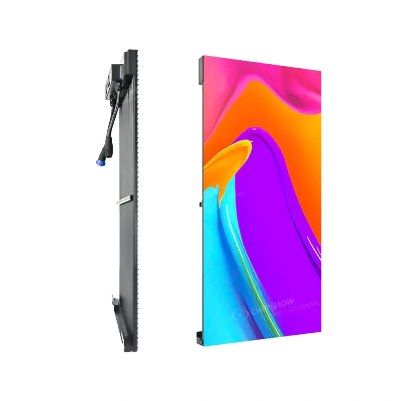
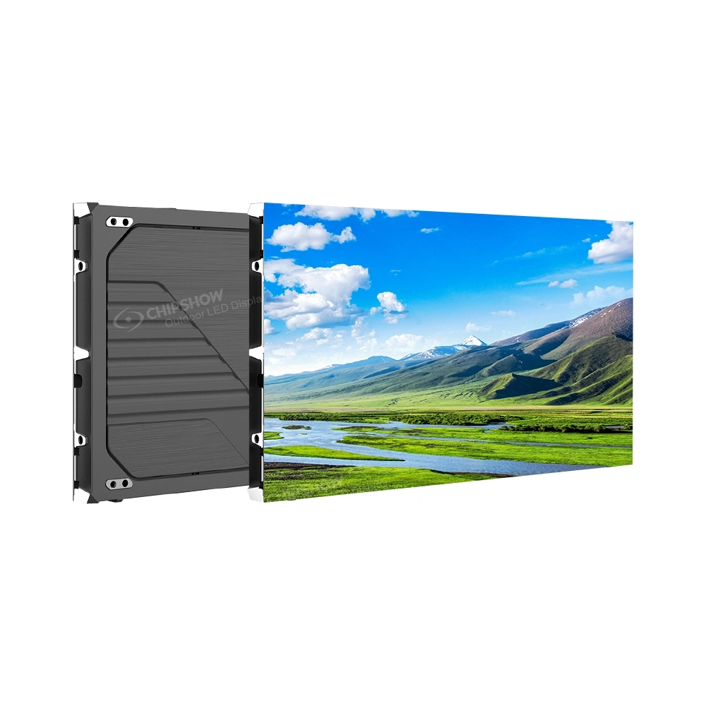
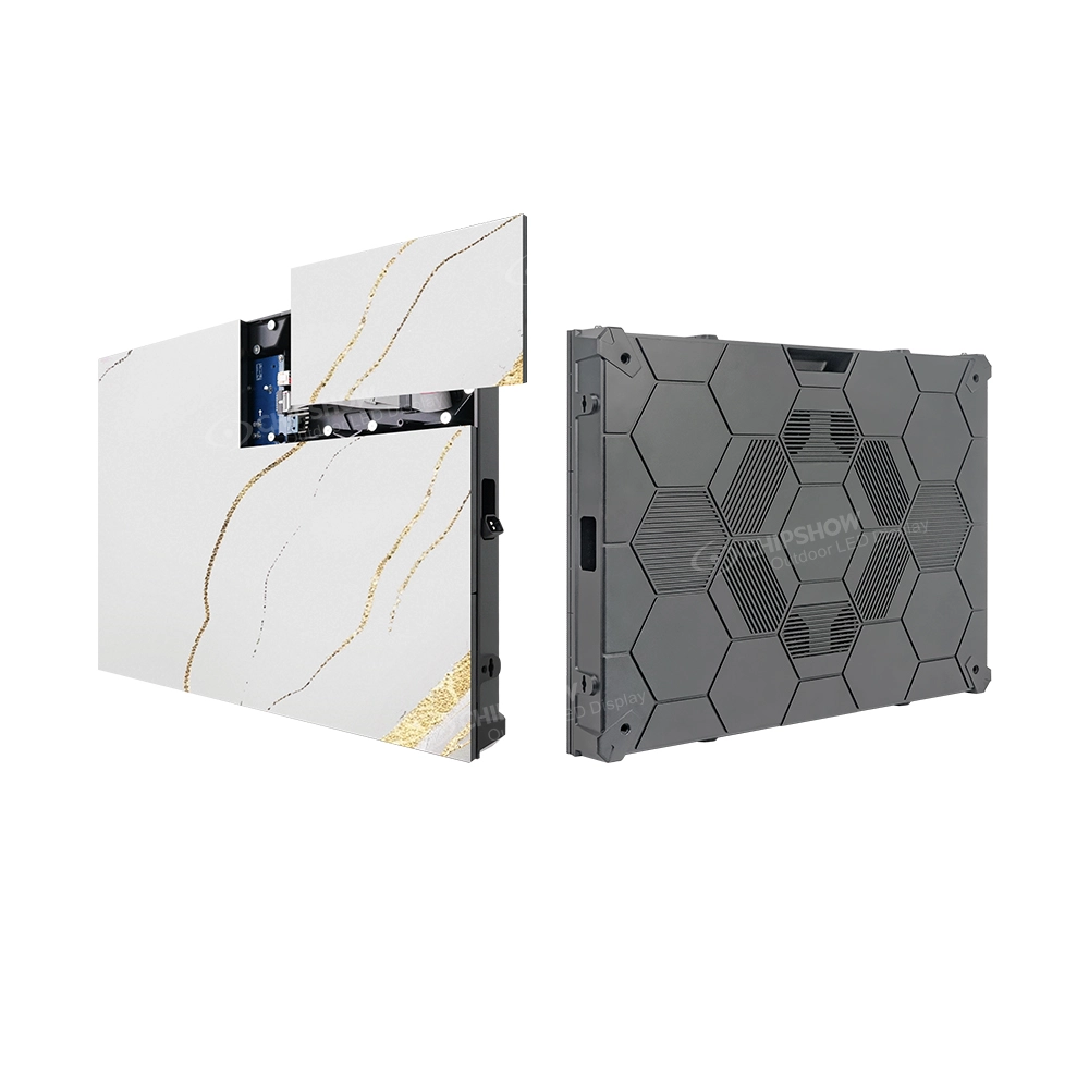
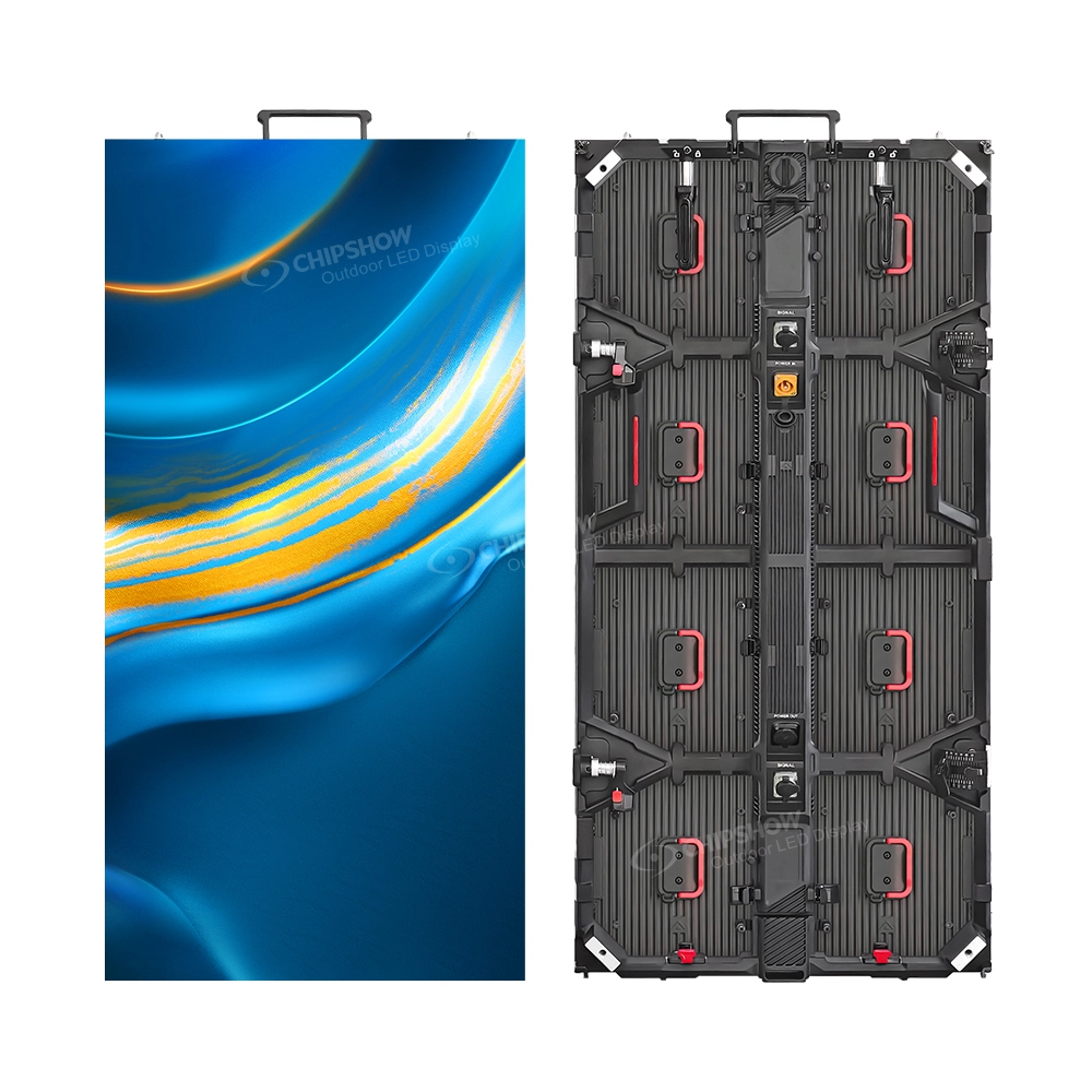
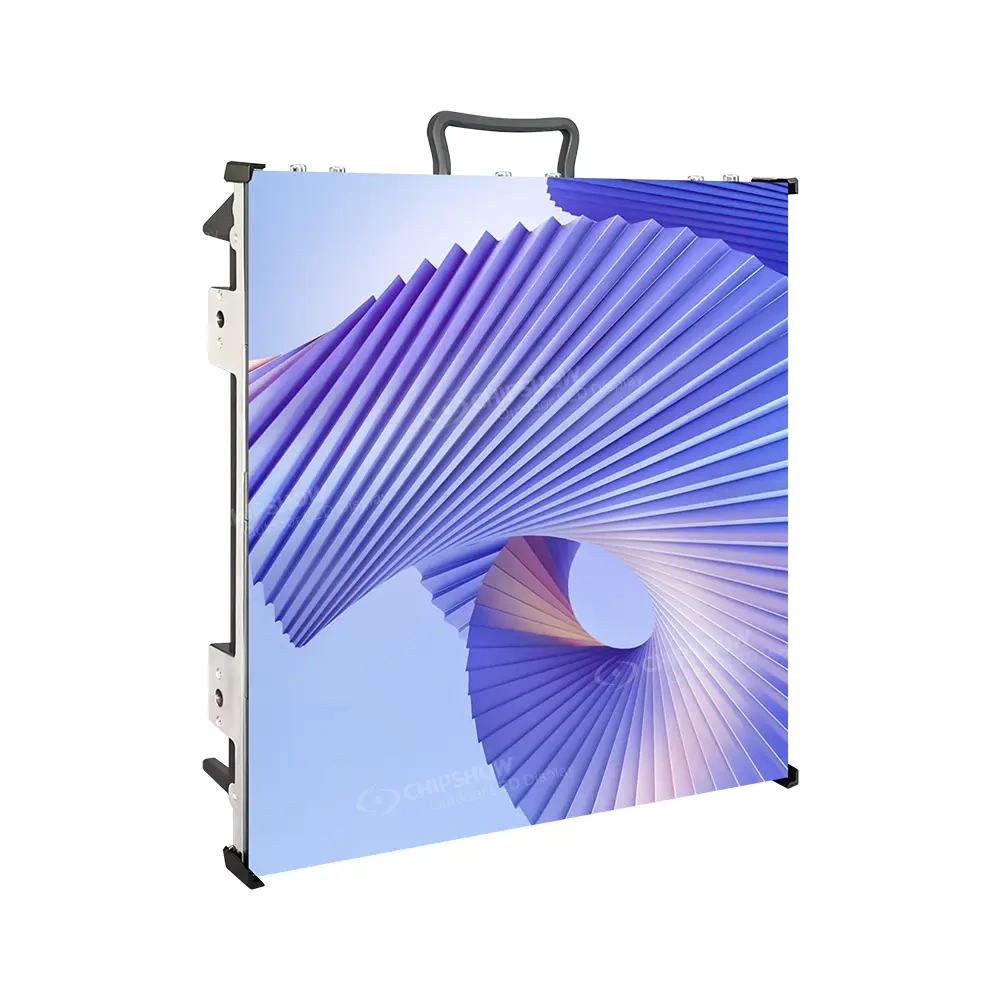
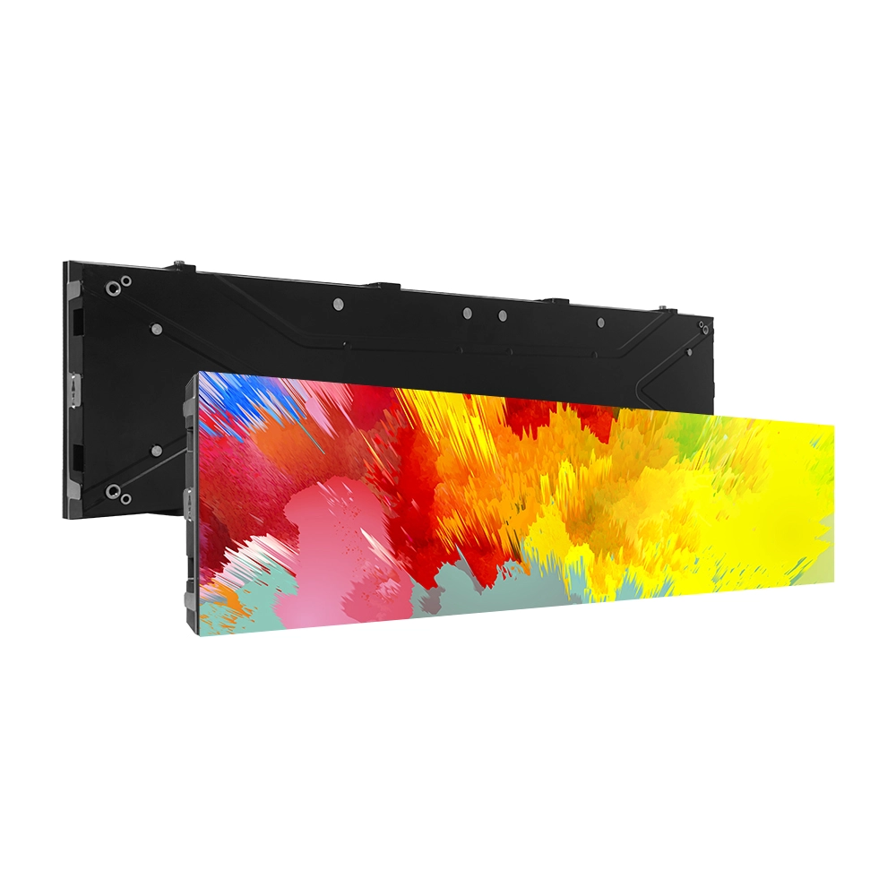
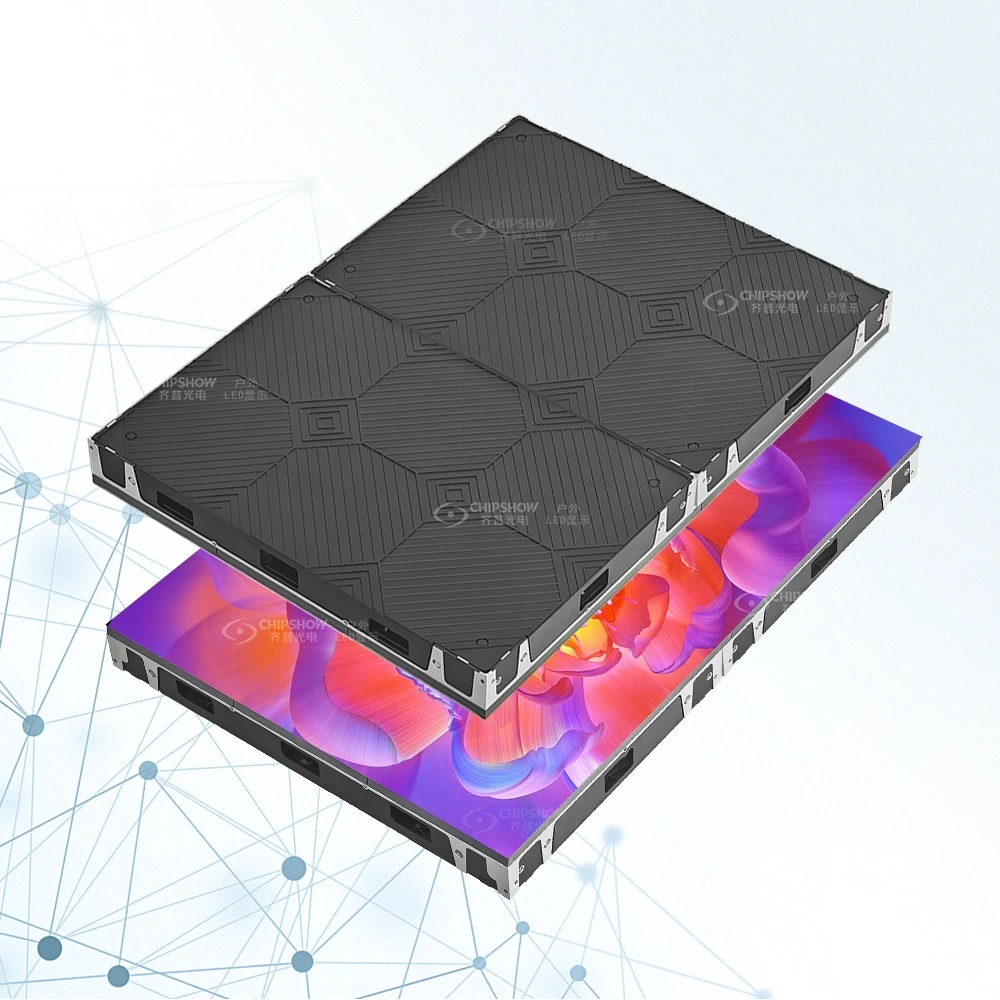
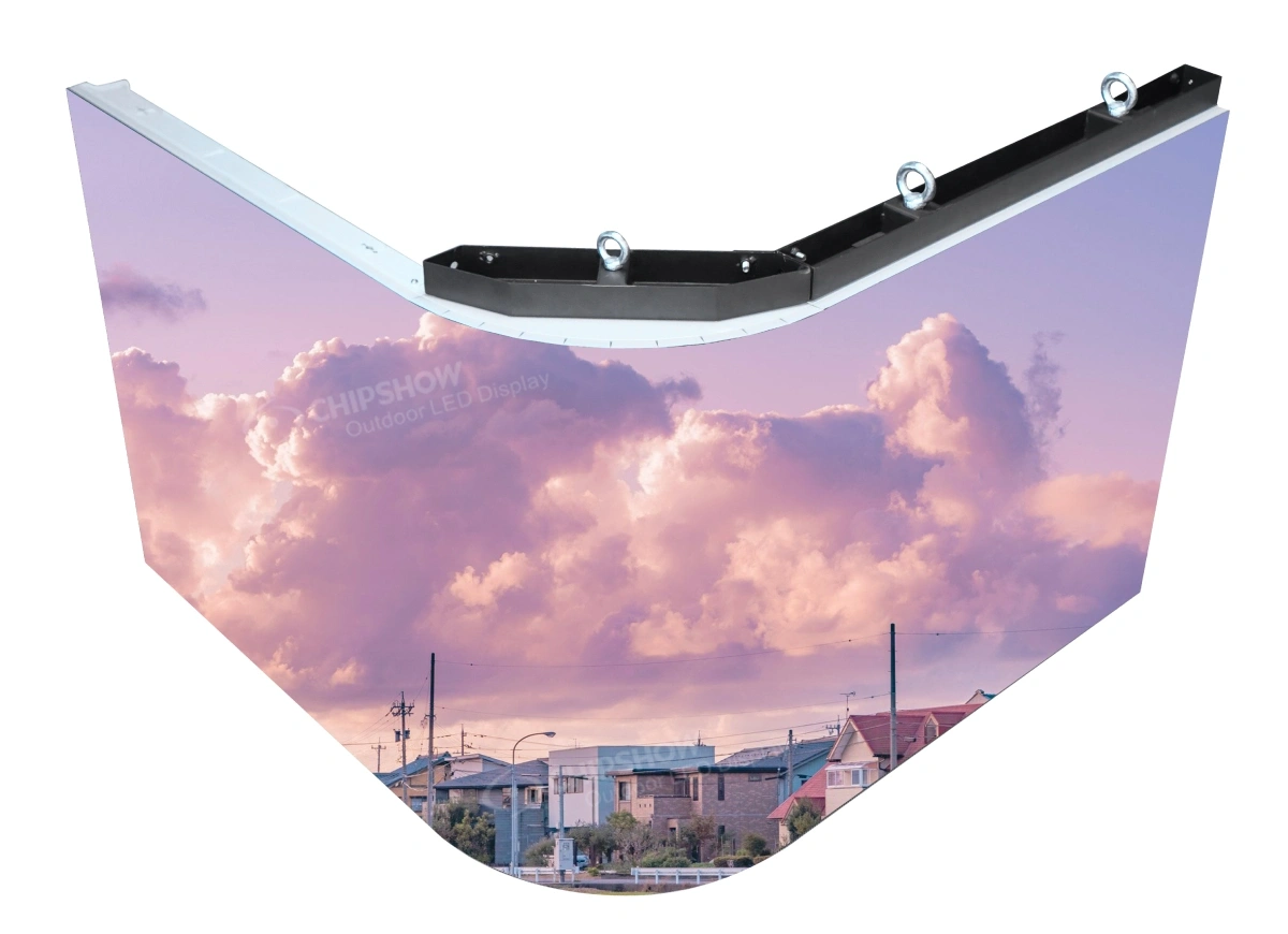
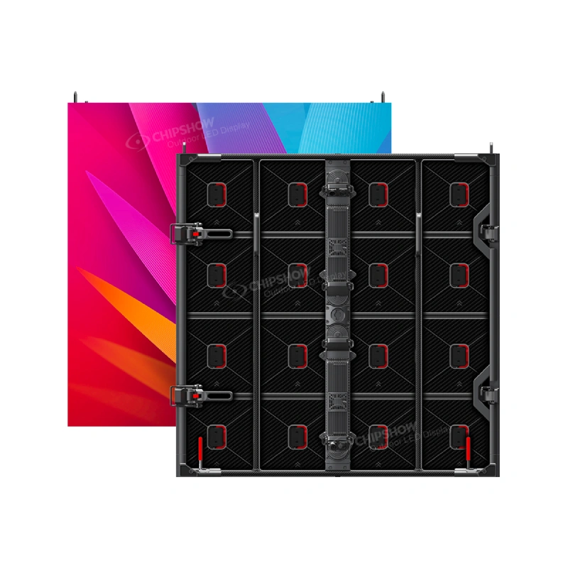
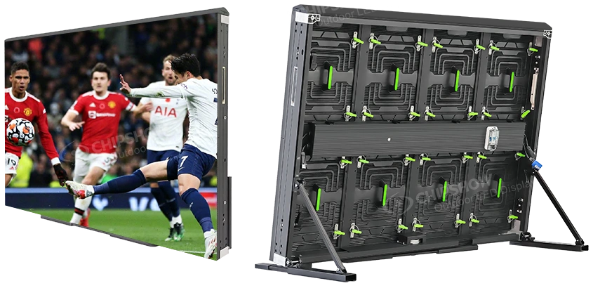
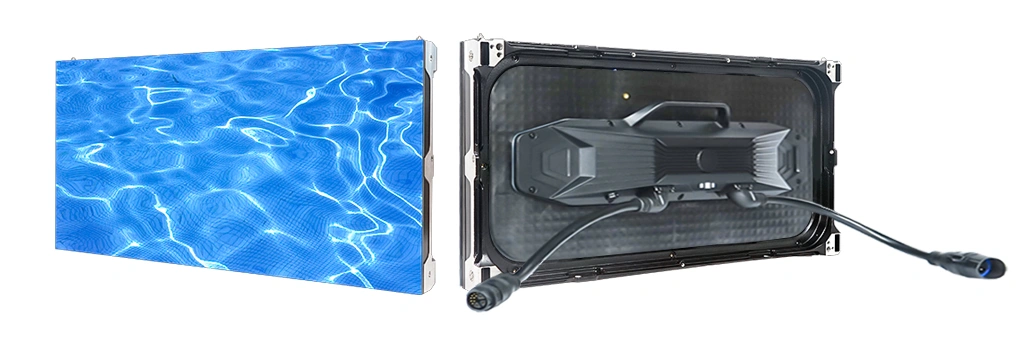
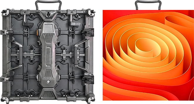
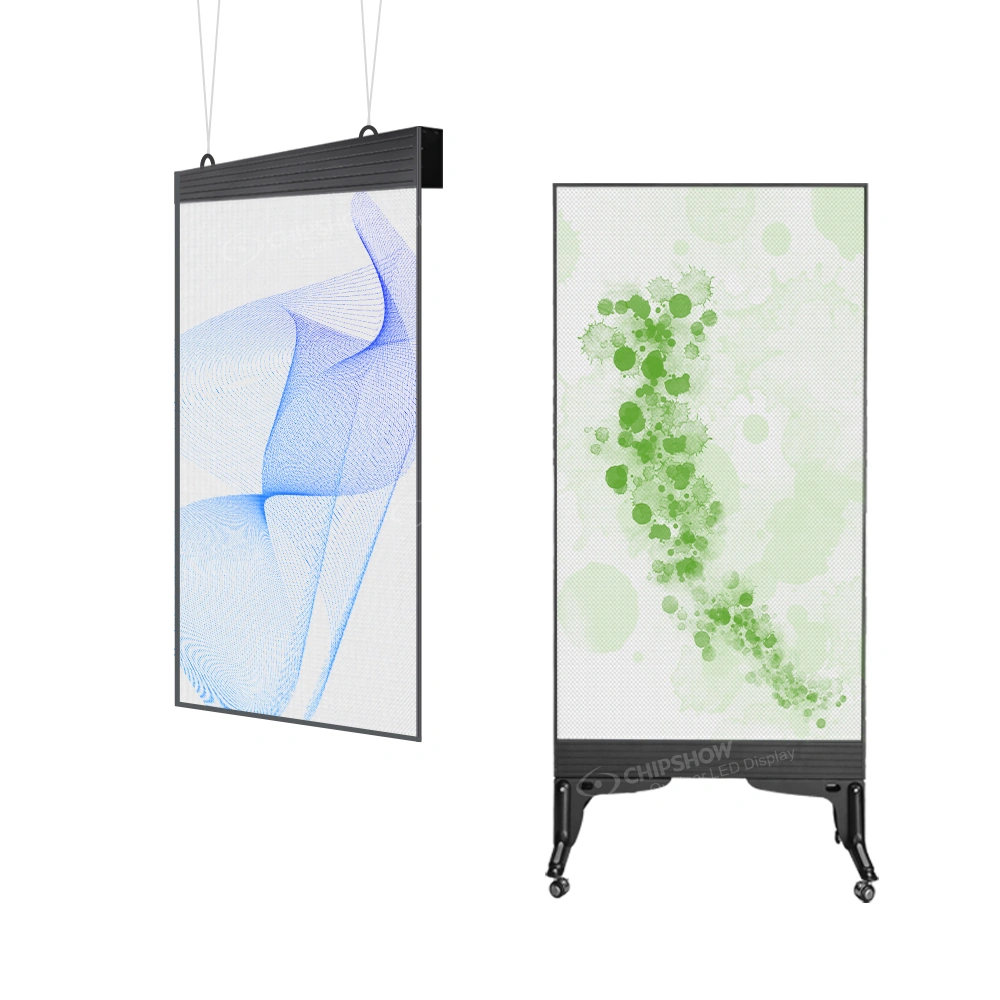
Chipshow builds outdoor platforms around these variables: the C-Slim outdoor LED display for high-sun faces, the C-Fit-Easy P6.67 platform with auto-dimming support, and 320×320 mm outdoor LED modules in P6.67, P10, and P16 for sign companies building their own cabinets. Brightness values are listed on those product pages, and the configuration is confirmed against the project’s elevation, viewing direction, content, and local requirements before an order specification is approved.
Project teams can send the face orientation, viewing distance, viewing direction, content type, and installation method to Chipshow for a configuration review. Contact us to start that review.
Frequently Asked Questions
Why does an LED sign look washed out in sunlight?
Daylight reflects off the display face and reaches the viewing position along with the light the display emits. The dark areas of the image no longer look black, which lowers the contrast between the text and the background. The display is still emitting its full output. The extra light reaching the eye comes from outside the sign.
Does a brighter LED sign always read better in daylight?
More brightness helps only while it raises the contrast between the content and the background, and the site may limit how much of that improvement reaches the viewer. Brightness works best when the content and the surface are already supporting it.
What makes text and logos readable on an outdoor LED sign?
Physical character size, enough pixels within each character, even stroke weight, adequate spacing, and a luminance difference between the text and its background. Typeface choice supports those factors rather than replacing them. Render the actual content at the display’s native pixel matrix rather than assessing it in a design file.
How should an outdoor LED sign be dimmed at night?
Output should be reduced after sunset so the display stays comfortable relative to its surroundings. Scheduled dimming is predictable and simple to document. Ambient-light-sensor dimming responds to weather and seasonal change. The parameter to confirm is the lowest brightness at which the image stays even and the colors stay stable, and the applicable local requirement should be checked with the authority having jurisdiction.